Localized Form Fields
You built your online form. You got it translated. You even got it localized. It is a lean, mean, international selling machine.
Right?
Except for that long-form label in German throwing off all the CSS floats… And how do you accommodate the French five-character postal code, versus a seven-character Canadian one, or an eight-character Japanese code? Whoa, there’s a lot to think about. Well, we’ve got some sure-fire tactics to help guarantee your online forms are internationally friendly.
1. Position labels and fields correctly in a multilingual environment.
When it comes to usability, the best practice for placement of a form label in relation to its field depends on a number of factors including form length and localization flexibility, amongst other things. Left-aligned labels are generally not recommended due to the difficultly to associate with their field when there is a large amount of white space between the two.
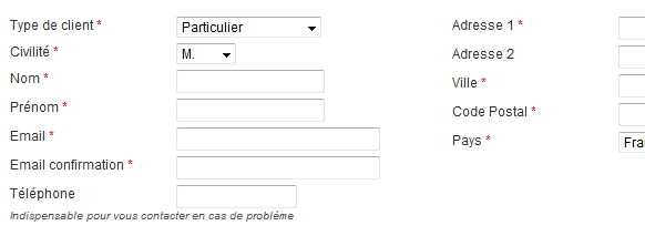
Right- and top-aligned labels are considered the best in terms of usability, but each has its drawbacks. Top-alignment enables efficient scanning, and minimizes form completion times, but it increases the vertical length of the form.
On the other hand, right-aligned labels show a clear association between label and field, but readability is decreased due to the flush right text (meaning the uneven alignment of text along the left margin).
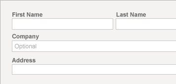
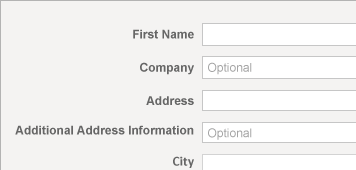
However right-aligned labels take up less vertical space which could be a concern for longer forms. In fact label placement best practices could be a separate blog post on its own (not to mention certain countries, like Japan, have different preferences).
When it comes to international flexibility, however, there is a clear winner. Whether your online form is a shopping cart, registration page or another type of data collection, the most important thing to remember is not all languages are created equally. Some are longer and some are shorter. If you place labels to the side of the field and allow 180 pixels of space, “Cardholder Name” will fit well in English with room to spare. But change the language to French, and “Nom du titulaire figurant sur la carte” will more than max out your allotted 180 pixels. The more languages you plan to translate into, the more likely you will encounter this issue. Especially if you plan to be cross-browser compatible!
The best way to save yourself a few headaches is to place the label above the field. There is a lot of room up there, especially if you have longer fields. This is the perfect location to allow longer languages to expand without destroying your CSS floats.
When not placed above the field, labels that are too long can push the page’s code structure, and consequently your fields, out of alignment:

Whereas when the labels are above the field, there are no issues:
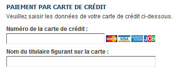
There are additional benefits as well. Studies show users tend to read Web forms from top to bottom instead of left to right, like they would with a book, so the user’s mind more quickly associates the label with the field. According to a study by Matteo Penzo, top-aligned labels also drastically reduce form completion times due to the need for fewer eye fixations between the label and the field.
2. Watch out for symbols.
Have you ever completed a web form and noticed every single field was marked with an asterisk?

Wouldn’t it have been easier to simply state “all fields required?” By 2011, most Web surfers have completed an online form, if not hundreds of them. We have a fairly good idea of what fields are required, and we never want to complete more than we have to.
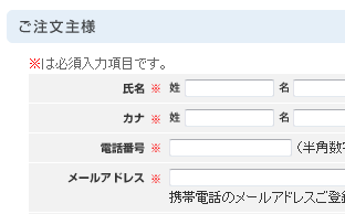
Not all countries use asterisks or bold type to denote a required field. For example the “※” symbol is a popular in Japan to show that something is important or deserves attention. An asterisk works as well, but “※” is so particular to Japan that it could be used to build consumer confidence so customers know they are dealing with a local company (or at least one that researched the market).
However there is a bullet proof way to avoid symbols all together. Instead of telling customers what is required, subtly tell users which fields are optional. Don’t make them learn a system to know which fields are required, for example Website X might use bold to denote required fields, while Website Y uses an asterisk.
Users don’t have time to learn a system. Let your customer assume — because they already do — that all fields are required. An elegant solution is to simply write “Optional” in a faint color in optional field itself. Again this allows ample room for languages in which “Optional” is a longer word, and it also saves your user from needing to learn a system. Of course be sure to have some JavaScript take away the word “Optional” once the user has clicked the field so they don’t need to manually delete it, and also validate all required fields on the back-end.
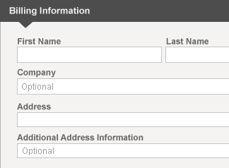
3. Let users enter phone numbers, postal codes and addresses their way.
Addresses, phone numbers, and postal codes vary in length in format in almost every country. In the United States, the standard telephone format is xxx-xxx-xxxx. The UK is xxx-xxxx-xxxx. Some countries have a country code of only one character (the U.S. is +1) while others have up to three characters (Finland is +358). In Italy the house number comes after the name of the street. In Japan most streets do not have names.
Hopefully before users begin completing the address form you have already tracked their GeoIP and loaded the form fields in a manner conducive to addresses in their country. However you should always allow users the ability to change their country because people do travel. Just because a Canadian is on vacation in Greece, it doesn’t mean he doesn’t want to buy your digital goods.
When it comes to telephone numbers and postal codes, the best policy is no policy at all. An American entering a telephone number may not know whether to put the area code in parenthesis, or with a dash, or with nothing at all. Again, don’t make them learn a system. Allow the user to input the number as they wish and have the website validate it on the back-end. You want the purchase process to go as smoothly as possible – and once you have his information you can format it the way you want.
Keystone
With a few simple tricks, your multilingual form will have fewer bugs and make your customers feel more at home – wherever they reside. That means higher conversion rates for you.