This past month, we looked into landing page optimization, business models for MMO games, Google’s take on frustrating checkout processes, and pricing strategies in a volatile currency market.
Here are some more articles from trusted sources on these topics:
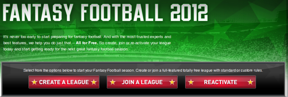
5 Conversion Rate Optimization Experts Critique an ESPN Landing Page | The Daily Egg – This post features our good friend Justin Rondeau, the Chief Evangelist from WhichTestWon, and several other marketing experts who analyze the landing page of ESPN’s Google ad for fantasy football. As a group, these analysts stressed concerns about using white text on a green field, allowing the visitor a way off the page through navigation menus, and the importance of highlighting benefits, like the fact that this service is free to use.
Leave a comment and tell us what you think about this landing page.
Free to Play: Monetization | Philipp Strecker– How does your organization handle monetization discussions? This post picks up on a theme we discussed in Pay to Play vs. Free to Play, and addresses some important issues that every product manager needs to consider:
- Decide at what point monetization takes place. This issue is important because certain elements of your sales funnel and even how your product is designed, will inevitably be affected by this decision. A product sold directly to a customer, for example, will have different requirements than a product marketed with a freemium offer.
- Discuss the possibility of up-selling functionality or even vanity customizations, like skins and appearance to your consumers.
- Is there a way to reward loyal users for their loyalty?
QVC shows how not to design a checkout | Econsultancy – This post highlights the criteria necessary for a smooth checkout process, unlike the process experienced by Nick4eva in Google’s humorous video. Elements of a smooth checkout process include:
- Make your delivery costs transparent.
- Clarify delivery options within the cart.
- Ensure visitors know your site is secure.
- Provide clear payment options.
- Don’t force users to register before checkout.
Is your pricing strategy costing you? | Competition Strategies – Here is a post from WisePricers, which illustrates three types of price setters:
- The Anchor Pricer – Customers are often uncertain if they are overpaying for a product or receiving a good deal. Anchor pricing is a way of creating price expectations in the minds of potential customers in such a way that they are comfortable paying your price. Anchor pricing, in the words of one neuromarketer, is how Starbucks managed to find success despite offering cups of coffee for $4.00.
- Beat Them All – This strategy works exactly as it sounds. In certain situations, your best bet might be to simply undercut your competition by lowering your prices.
- Late Bloomer – Consumers are more savvy than ever and they can effectively research products and prices before setting foot in your store. A late bloomer has priced their product too high for the market and so they will suffer from abandonment issues. The key point in this situation is to keep an eye on your market and react quickly to changes. Do not give visitors a reason to visit your competition.
The Difference Between Information Architecture and UX Design | UX Booth – Information architecture handles questions concerning how information is structured throughout your site. To structure information correctly IA professionals must understand the purpose of your site and the needs of your target audience. But that is merely the skeleton of the entire user experience. UX design fleshes out not only specific details of the UX, but incorporates the context of the user. In other words, IA design incorporates just the necessary requirements of what a user needs to accomplish, but UX design incorporates taste, flair and attitude into a site visit.
