The Internet has changed our world from a local view to a global perspective. No industry has been more affected by this evolution than e-commerce. Even though our eyes are now open to the intricacies of far away lands — thousands of years of cultural values and mores are slow to catch up, and socially ingrained ideas of beauty run deep.
Today localizing language is common place compared with 10 years ago and international organizations easily understand their ability to reach a larger number of potential customers. Now there is a new type of localization catching on: visual design localization. And the largest visual differences are found between North American design and Asian design.
What’s happening in North America
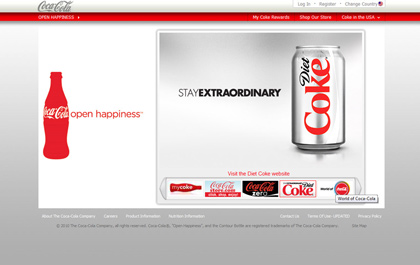
“Clean” is a word commonly used in North America to describe good design. Straight-forward, simple and elegant designs are prized for their clarity and ease of use. Large images serve as main focal points and often take the place of copy. Menus are usually tucked away and expand when moused over.
The American version of Coca-Cola’s website is a classic example. The two large images of soda act as the visual focal points and the only full sentence on the entire homepage is the disclosure statement.
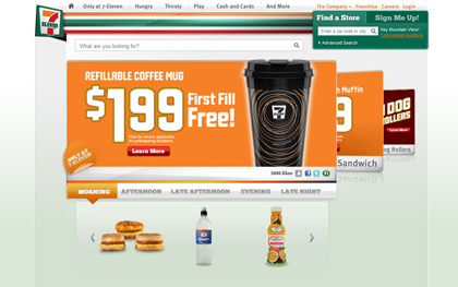
7-Eleven’s U.S. website also uses a clean layout with the promotion as the focal point. Expandable menus are neatly located at the top of the page as well as below the promotion. Pictures are used in place of words in the food selection menu toward the bottom of the screen.
What’s happening in Japan
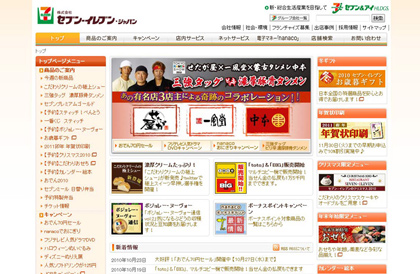
The style in Japan, however, is quite different. The emphasis turns from pictures to text. The images tend to be small and calligraphic in nature. Instead of expandable menus, each category is statically listed. The Japanese version of 7-eleven’s homepage has the complete menu listed in the left column. The visual design is quite a departure from its American counterpart.
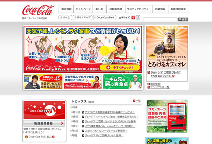
The Japanese Coca-Cola site also follows the Japanese trend towards a lot of text:
What’s happening in China
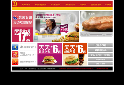
Chinese Web design aesthetics fall somewhere between the two extremes. While there are large images, there is also more text.
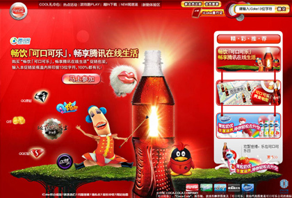
There are some key elements that are unique to the Chinese market. Red and yellow colors are used often, which signify happiness and good fortune in Chinese culture. Flash-based websites are also more common than in the West, although this trend is decreasing.
Why such a big difference?
One theory behind the extensive use of text in East Asian design is the fact the double-byte characters typically found in countries such as China, Japan and Korea are extremely difficult and time consuming to type on a keyboard. Thus, attempting to use the search function on a website can be extremely cumbersome.
For example, in order to type the word “sushi” in Japanese, you’d have to follow these steps:
1. Select the correct input character set
2. Type the English letters s-u-s-h-i. The computer converts them into the basic character set, or Hiragana: すし.
3. Then you have to press the space bar to scroll through and select the correct pictogram character, or kanji, in this case: 寿司.
4. Once selected, you must press the Enter key to continue to the next word.
Wow – just imagine if you wanted to search for “nutritional information for a spicy tuna sushi roll.” It is pretty clear that Asian users would rather click on a string of characters rather than typing into a search bar. This is why many Asian websites include as many links as possible.
Other factors relate to art history, particularly in the case of Japan, which was a “closed country” from 1633 until 1853. Without external influences, Japanese art flourished under its own design aesthetics until the country was re-opened in the mid-19th century. As such, during the 20th century while the Western art scene debated the finer details of Art Deco vs. Art Nouveau or Mid-Century Modernism vs. Post-Modernism, the Japanese and much of the Asian art scene debated traditional Eastern art vs. newly arrived Western aesthetics. What has resulted is an ever-changing evolution of the two.
The Digital and Software Space
Visual design localization is more prominent for consumer products than purely digital products. Often, only the language is localized while the design remains the same.
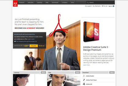
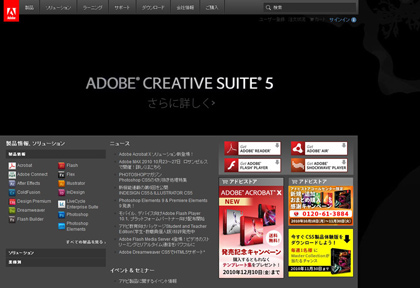
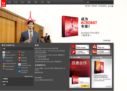
However there are a couple noticeable differences. Adobe, which could arguably be considered more of a consumer product than some other forms of software, follows the strong consumer design localization trend. The American site features large images and little text, while the Japanese and Chinese versions have smaller images and again a full menu appears in the left column.
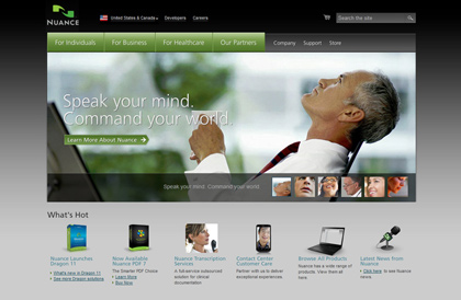
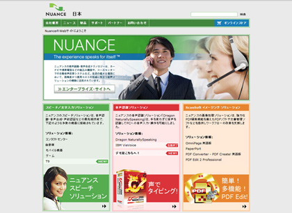
Nuance North America also follows suit with a large main image and an extensive rollover menu while Nuance Japan is heavier on the text.
Keystone
Localization goes beyond translating text. When selling internationally, research the aesthetics and usability considerations of the targeted culture and design accordingly.
Is your company using these visual design localization principles? Do you have any examples in the digital product space? Tell the community about it!
Jennifer Tucci contributed to this blog post.