I’ve been reading a lot about design trends and speaking with expert designers on this topic. I’ve learned that trendy webdesign features like infinite scrolling and parallax design can be useful in certain situations, but when it comes to designing an ecommerce site, the most important things to keep in mind are your business goals and the needs of your customers. It’s in this context that I’d encourage you to reexamine your site and consider its effect on visitors.
Business Goals and User Experience Above All Else
Maybe you’re using a WordPress theme and stuffing your content into a template. Ideally, though, you want to design your site around your business goals, not vice versa. The main thing is to know the purpose of each of your pages. Once you figure that out, you can design each one according to its unique needs.
Bad web designers say, “Oh, here is a new trend. I am going to implement it.” That is valuing style over substance. Good web designers say, “What problem are we trying to solve?” and then set out to fulfill their objective.
To design a website properly, the first thing you need to do is write down your goals. After you determine your goals, write up a hierarchy of information that informs the design. The hierarchy should tell you where content belongs within the context of your site. That means trying to get visitors to visit product pages before shopping carts and understanding that homepages aren’t deep dives into the technical aspects of a product’s capabilities. Consider what you want the user to do as well, since the point of every webpage is to get the user to complete an action.
You will need to consider all the various types of pages that constitute your site, such as:
- Homepage
- Landing pages
- Product pages
- Shopping cart and checkout pages
- Confirmation pages
- Help pages
Testing …
As I said above, you want to make sure your webpages are accomplishing your business goals and that users are taking appropriate actions. Unfortunately, you have a disadvantage in confirming whether or not this is happening, and are inevitably affected by visual suppression: You have looked at your design for so long that you no longer see it as a new user might.
One solution to this problem is to grab anyone and give them the one-second test. Have them glance at what you’ve built, and then ask them what they saw. Did they notice what you wanted them to notice? Their responses will tell you things such as whether your sidebar is too bright, your logo is too prominent, or your CTA isn’t conspicuous enough.
… and Monitoring
Once everything is live, you need to monitor activity. Depending on the page and its goals, success is measured in terms of:
- Click thru rates
- Time on page
- Bounce rates
- Form completions
- Cart abandonment
- Conversion rates
- Pick rates for cross-sells and up-sells
Mobile First and Foremost
If you haven’t yet already, it’s time to jump on the mobile bandwagon. As cleverbridge Senior Designer James Mikrut told me, “Mobile design isn’t a trend; it’s a necessity.” It helps your users digest content more easily and makes the content more accessible.
Internet access no longer requires sitting at a desktop computer at your house or local cybercafé. You now pay your bills online while waiting at the bus stop. According to a recent study by Pew, two-thirds of Americans (over 200 million individuals) own smartphones, while 15 percent (45 million) access the Internet exclusively through their smartphones.
More importantly, Google is starting to penalize mobile-hostile designs. Last November, Google warned companies that mobile friendly sites would be highlighted in SERPs. What started as a helping, friendly note to users is now a business requirement, and your site will be punished for non-compliance.
The upside of the mobile revolution and its attendant focus on responsive design is that instead of creating pages that may or may not look good on different screen sizes, your company can design clean, legible and readable pages for any screen size. For example, according to Mikrut, full width websites are a natural side effect of responsive structure because web designers are no longer afraid of making something too big for small viewports.
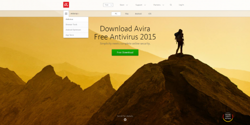
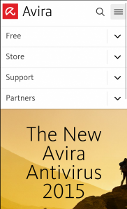
A lovely example of a software company who understands the above point is Avira. Notice how clean their page looks, in terms of the readability and legibility of the type, on both a desktop and mobile screen.
Popups, Interstitials and Don’t Leave Layers
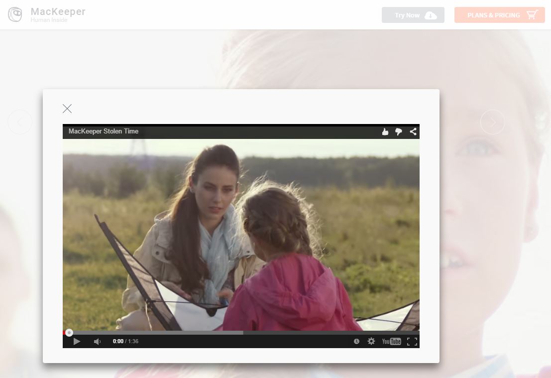
Popups, interstitials and don’t leave layers can be valuable as long as they don’t hijack your users’ attention. A good use of a popup may be a video on your homepage as MacKeeper and Nitro use.

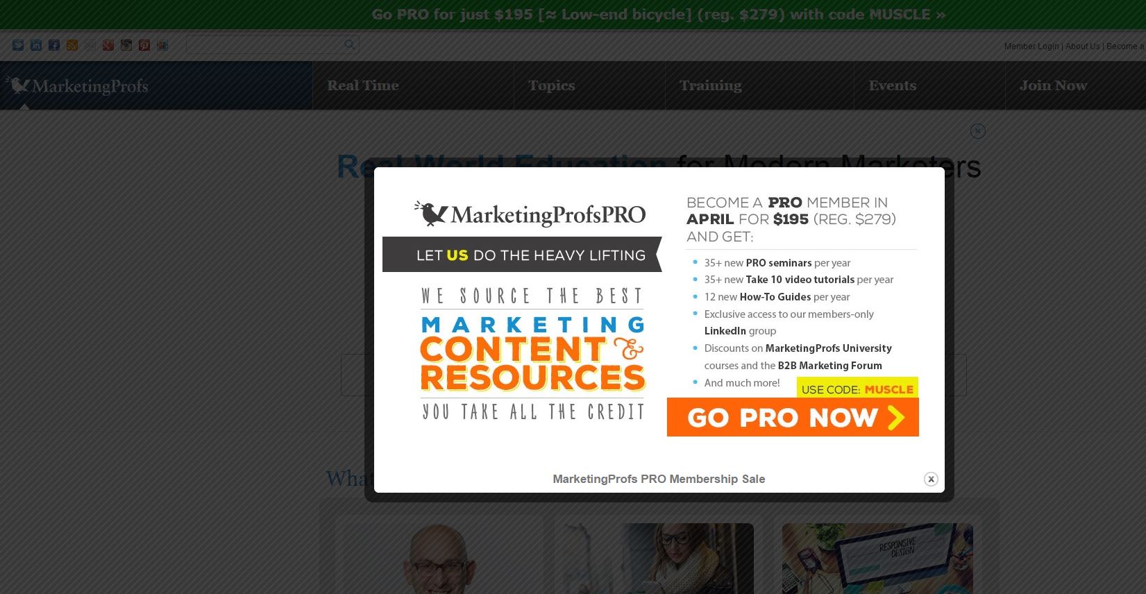
If you absolutely have to use popups to try to increase subscribers to your email list, consider the examples of Impact blog and MarketingProfs blog. The former has a small bar that slides down from the top of the page and allows you to continue to read their content, while the latter interrupts your reading and demands that you deal with their message on their terms. It’s the difference between a classy professional and an attention starved child.

Your website’s design influences conversions. Do you think your offering is more attractive to your customers when you showcase an outdated look with boring typography and a non-responsive design? An attractive design based on a well-thought-out strategy is the honey that catches the flies.
Keystone
Web design isn’t about implementing the latest trend — it’s about accomplishing your business goals.