In his campaign to become President of the Unites States in 2008, Barack Obama raised half a billion dollars in online contributions. Unsurprisingly, the power of the Internet has led all the Republican primary candidates in this election season to drive online donations through e-stores.
In this post we review the ecommerce tactics used by these political “brands” in their attempt to influence “customers” to buy their “product.”
Of course, we’re not here to endorse any candidate or argue for correlation between a well planned channel strategy and the number of delegates these potential nominees pick up on the campaign trail.
But the fact is that these online stores generate millions of dollars for organizations to coordinate a full scale, nation wide operation. And these stores can only accomplish that if visitors click that “Donate” button on the shopping cart.
Method
For the purpose of this post, I’m limiting my review to what happens when a person googles the first and last names of the current batch of politicians running in the primary election. If ads were displayed as a result of my search, I clicked through to the landing page and recorded my observations.
My judgements of what is an acceptable landing pages are based on criteria outlined in our post, 5 Pitfalls To Avoid In Your PPC Landing Page:
- Do not use your home page as the landing page
- Do not distract your visitor with too many choices
- Do not hide your call-to-action
- You must collect user data
So without further ado, let us begin with a review of Barack Obama channel. (Note: The red arrows point to the type of landing page behind each link.)
Obama – The Ad
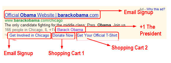
My first reaction here was, “This ad is too busy.” But as I considered the result of broad keyword like “Barack Obama”, I began to think maybe providing different options is the right thing to do, as long as the landing page behind each link is appropriate.
Out of the four ads analyzed in this post, the Obama ad has the most options, in that a single ad leads to four distinct pages. One page is designed to collect email addresses, one for social interaction and two are shopping carts.
Obama – The Landing Page (Donate Now)
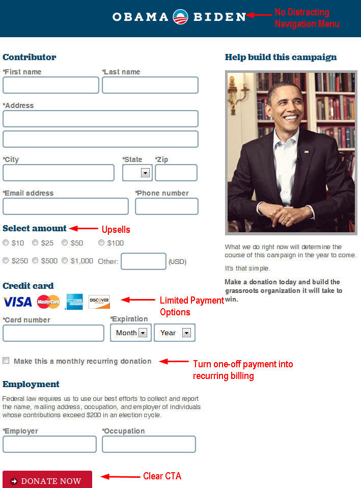
Above is the landing page that appears when one clicks the “Donate” link on the Obama Google ad and it seems to follow our rules about landing pages.
- The home page is not the landing page. Rather, it is a sleek, uncluttered shopping cart.
- There are no distractions: no navigation menu and only two, fairly hidden links leading the visitor away from the cart.
- The call to action is clear. The visitor knows they are here to “Donate Now” to Obama’s campaign.
The page specifically relates to the ad clicked. A searcher clicks “Donate” and is presented with an opportunity to submit payment. I also commend this cart for allowing customers to choose a recurring billing option. And seven radio buttons easily allow the campaign to present upsells to the visitor.
One flaw I find is the lack of alternative payment options, as some visitors may not have a credit card. Only towards the bottom of the page is one made aware that one may send an offline check to the campaign, but why not offer PayPal or some other online options as well?
Romney – The Ad

This ad is different from the previous. Whereas Obama offers the searcher many options, here we have a simple and direct message: Click this link if you want to meet Mitt Romney and go to a baseball game with him. Sounds fun!
Romney – The Landing Page
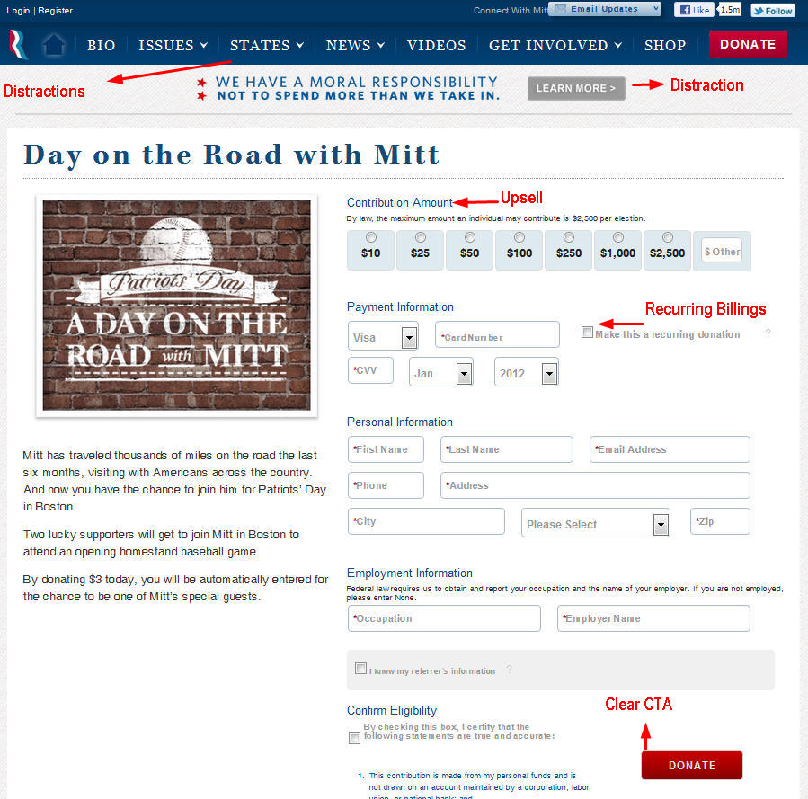
As before, I like this cart for its upsells and recurring billing options. But I thought the landing page was disconnected from the ad’s message. The ad led me to believe I was going enter into a contest for baseball tickets but instead, I land in a shopping cart. Which I am fine with initially. Only later, in the fine print, do I discover that I don’t have to submit any payment to enter the contest. This somewhat duplicitous funnel leads me to think that the ad should have had two options for searchers: one link to the contest entry page and another link leading to the cart.
Aside from that little bit of chicanery, the Romney cart also violates rule number two: Do not distract your visitors.
The header is littered with click-able links, most of which lead away from the cart and straight into abandonment. There are two giant red donate buttons, one of which simply refreshes the page, sans the opportunity to enter the contest.
Furthermore, why is there a “Shop” option on the menu which directs a visitor back to the store? If they’re already in a shopping cart, encourage them to proceed to checkout, not go back and wander in the aisles.
Santorum – The Ad

Like the Romney ad, Rick Santorum’s has a simple and straightforward message. Unlike the Romney ad, it’s honest in its call to action: Make a donation now.
Santorum – The Landing Page
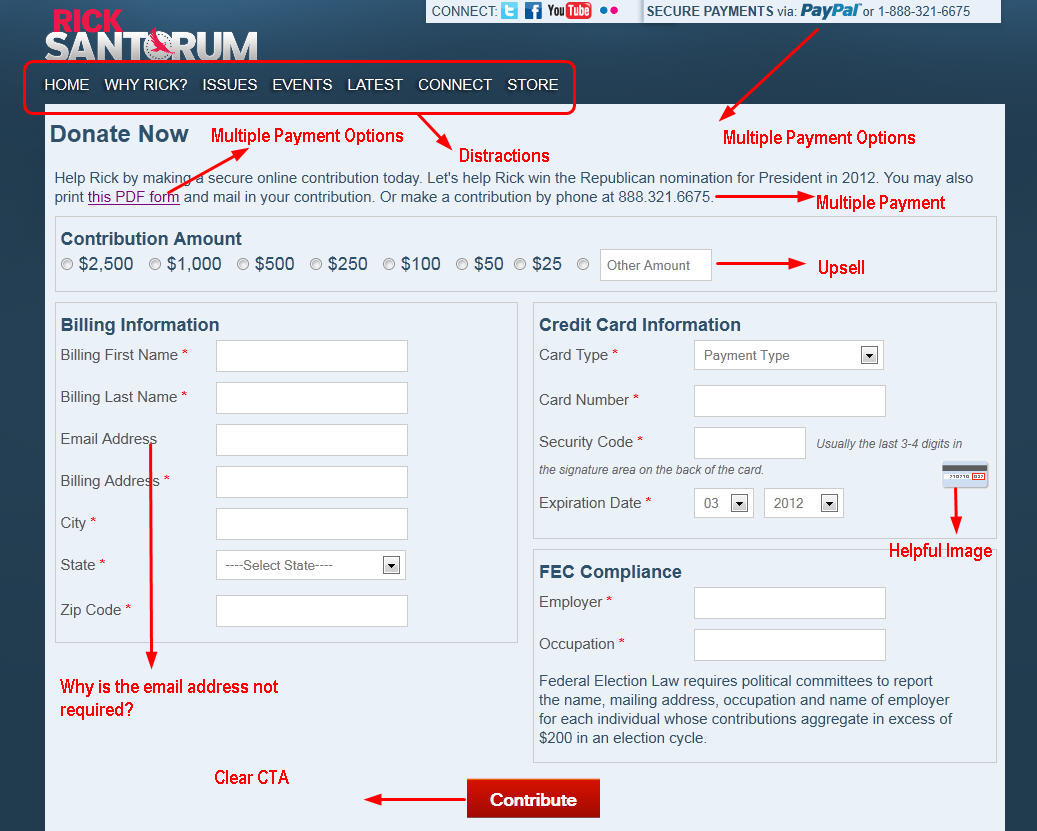
This is the first cart we’ve seen that allows PayPal as a payment option, so kudos to the Santorum team. It’s also the only one with a helpful image to explain CVV codes. This cart also offers an upsell, but strangely, does not provide an option for recurring bills. The navigation menu at the top isn’t nearly as distracting as the one in the Romney cart, and thankfully, there is only one big red CTA button.
This is a relevant page to the ad I clicked, but without pictures, it seems cold and boring compared to the Obama or Romney cart.
Gingrich – The Ad

Unlike, the nuanced Google ad from the Obama campaign, the enticing opportunity to attend a baseball game with Mitt, or the plain and simple request for a donation made by the Santorum team, Brand Gingrich sends out a vague request to help them by joining a movement. Which would be understandable if the landing page was a simple signup form or a commitment to volunteer. Instead, I land on an informational site with an emphasis on social networking.
Gingrich – The Landing Page
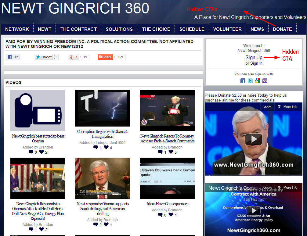
The fact that there is a YouTube video explaining how to use the site confirms this as an unintuitive and inefficient landing page. It also violates all the rules mentioned in our introduction. The landing page is the homepage. There is a lot of distraction with the navigation menu, videos and social networking options. The calls to action blend into the background of the page. And finally, there is no immediate step to collect user information. This sort of hasty, unclear design is further reflected in the shopping cart and the signup page.
Rule #5 – Test
Of course, these are merely observations. Without goal setting and testing, my observations don’t tell you much. You must test your design before you can have any idea whether a practice is useful or not.
Keystone
The content of an ad should accurately reflect the content of the landing page. Whether the goal is to convert visitors to paying customers or simply acquiring visitor information like email addresses, that content should be simple and laser focused on guiding searchers and visitors to that goal.
Share your PPC/Landing page stories. How cluttered can an online ad be? How many options should it provide search engine users? How closely must the content in an ad and landing page resemble each other?