Raise your hand if you’ve heard of Boleto Bancario. Raise your other hand if you know what Ãœberweisung is. Take the day off if you know what iDeal is! Just kidding about that last one, but people who know ecommerce know that local payment methods are a vital piece of the conversion puzzle in international ecommerce. How you present payment methods significantly influences how successful those payment methods are.
Payment methods are the variable du jour in today’s digital goods ecommerce. When you talk to people in the industry, it’s like an arms race to see who supports the most payment methods. The reason is simple: if your customers prefer to pay in a particular way, you should offer that payment method to reduce friction in the purchase process.
For historical, legal and accounting reasons, different payment methods have proliferated in different countries and regions. Countries like Germany where consumers are taught to buy within their means results in wire transfers as the most important local payment method. In Japan, where population density is great and visits to convenience stores are frequent, the Konbini payment method is a popular alternative. Even the Internet itself gave rise to PayPal as an increasingly popular payment method in many countries.
With credit card sales booming, selling only in U.S. Dollars and the English language is a thing of the past for digital goods. Most companies have dramatically added to their list of payment options over the last few years as local payment methods like Konbini, Boleto Bancario, iDeal, WebMoney, MoneyBookers and others have increased awareness outside of their regional homes. Yes, this is a good thing. However, long payment method lists have created a problem in the checkout process, which you can see in the following real-life example:
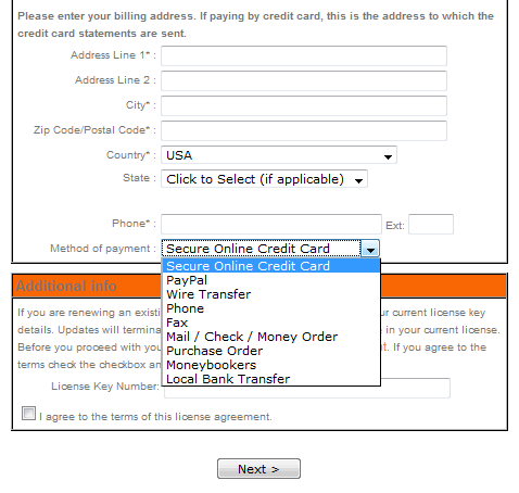
How long does it take you to read all of the options that are listed in the drop-down of nine? Are there REALLY nine legitimate payment methods for you in YOUR region? What happens if more payment methods are added? This becomes extremely cumbersome. Giving customers too many choices is often worse than a one-size-fits-all mentality.
How about this alternate example (also real):
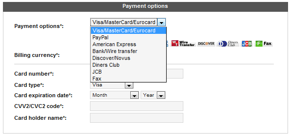
This example includes eight payment methods, but five of them are credit/debit cards. In this day and age, shouldn’t your ecommerce system understand which card is being entered without having to ask the customer?
Another issue with the selection lists shown in the two examples is that customers, who use the scroll wheel on the mouse, have to click to expand the list; click to select their preferred payment method; then run into a problem if they choose to use the scroll wheel without clicking on the background of the browser. If the focus of the mouse is still on the expandable list when the scroll wheel is spun, customers can easily accidentally select the wrong payment method! And if the options associated with the payment method change automatically, the screen starts to move and change in a hurry, which isn’t the most comforting experience.
Before we leave these two examples, let’s recap four best practices for payment method presentation:
- Use GeoIP to filter payment methods by the country your customer is coming from.
- Consolidate credit cards into a single payment method.
- Let your ecommerce system process the type of card accordingly without requiring the customer to choose
- Display rather than hide all relevant payment methods to minimize clicks to reach order completion
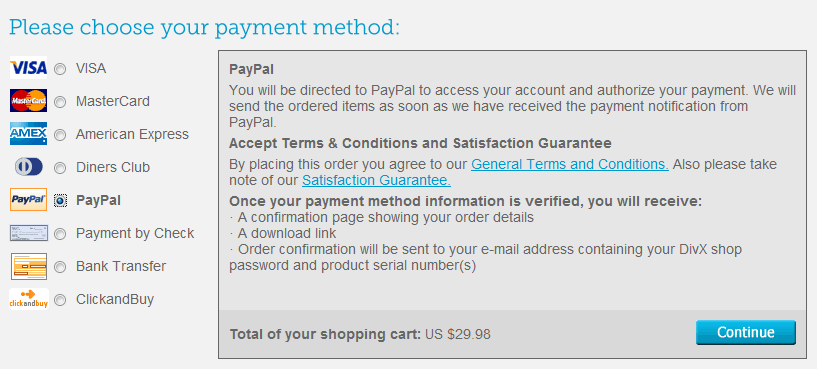
The following example filters the options being listed and doesn’t require more than one click to change payment methods, but it doesn’t consolidate the credit/debit card payment methods.
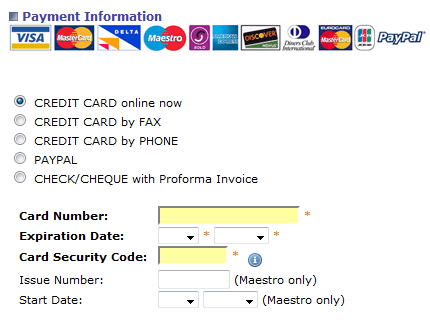
Another example of a payment method selection list that consolidates the credit card options is below. However, this example isn’t able to determine that coming from the U.S., I don’t use the word CHEQUE for CHECK, nor do I know what Maestro is.
Finally, another option for listing payment methods is in a horizontal row, as opposed to the vertical columns that we previously have seen. This works well as long as you don’t have more than four unique payment methods, which is a reasonable number for any country as long as you can accurately detect the country from which the customer is visiting.
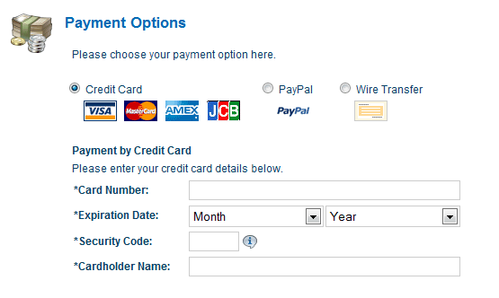
Whether you choose vertical or horizontal listing of payment methods is up to you, but the important point it to display the available choices rather than hide them in a drop-down list.
Keystone
Customize the list and display of international payment methods to avoid increasing confusion at the point when your customers are ready to pay.
What other optimizations around payment methods have you seen that resulted in a conversion rate increase? Have you tried adding additional costs by payment method and had a negative result?
Great article, and right on the money. Sadly tho, I still see plenty of websites that are stuck in the past.