Payments are the linchpin to ecommerce success. So it is imperative that your checkout process is designed to make paying for software as easy and intuitive as possible. But so many companies encumber their website visitors with inefficient processes. These inefficiencies are conversion killers and must be avoided at all costs, as they not only burden the checkout process unnecessarily, but reflect poorly on a brand as a whole.
“Buy Now” Means Buy Now
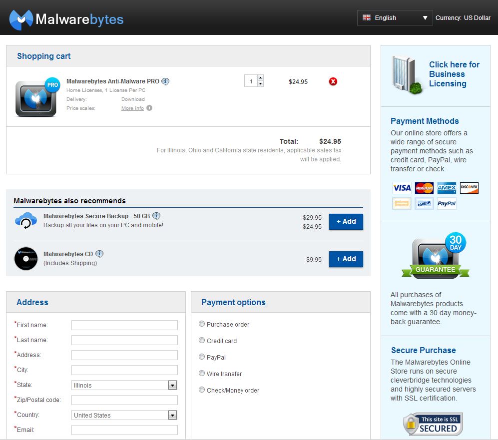
Ideally, your checkout process should be as concise as possible. Take a look at Malwarebytes’ checkout process. It only takes one click to get to the shopping cart from the homepage.

If the visitor clicks the big green “Buy Now” call-to-action (CTA), we can assume they want to enter the shopping cart. The fact that a visitor to this site immediately lands in a Malwarebytes cart after clicking “Buy Now” clearly fulfills their expectation.
Interstitial Pages Designed For An Up-sell
Occasionally, a software company lengthens the checkout process by inserting an interstitial page between clicking “Buy Now” and landing in the cart. Interstitial pages function as an interruption between a visitor clicking on a link and arriving at their desired destination. These pages can be dangerous if they push potential customers off track and prevent them from purchasing.
Interstitials should therefore be used sparingly and mainly to offer an up-sell or cross-sell. WinZip does a good job of using an interstitial page as a space for upselling a higher priced product. For example, a visitor to WinZip’s homepage is presented with several CTAs, one of them being a “Buy Now” button.
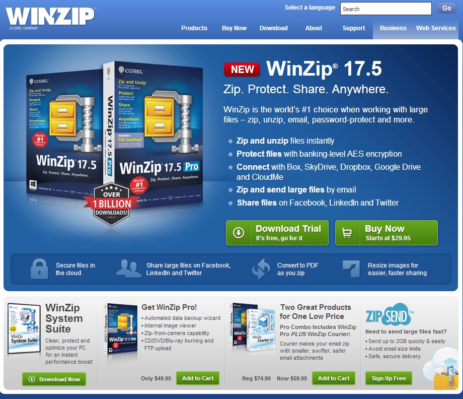
Once a customer clicks that buy button, they are not immediately taken to the shopping cart. Instead, WinZip directs customers to a way station where they are offered upsells.
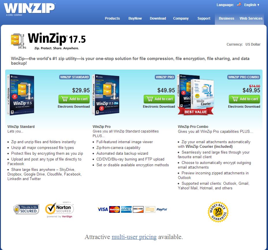
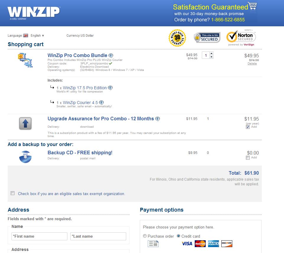
The visitor can either click the cheaper priced product or one of the other two higher priced products. Either way, this is the last stop for the visitor on their way to a shopping cart that displays a form based on the browser’s language settings and the computer’s GeoIP location.
Interstital Page That Hinders Conversion
Unlike the WinZip interstitial, the following checkout process with its interstitial has the potential to fully break the customer’s shopping experience, leaving the visitor with a WTF?! moment. The journey starts off innocently enough with a homepage that displays a carousel of products.

If a visitor decides to buy the product, they are taken to a landing page that includes a buy button.
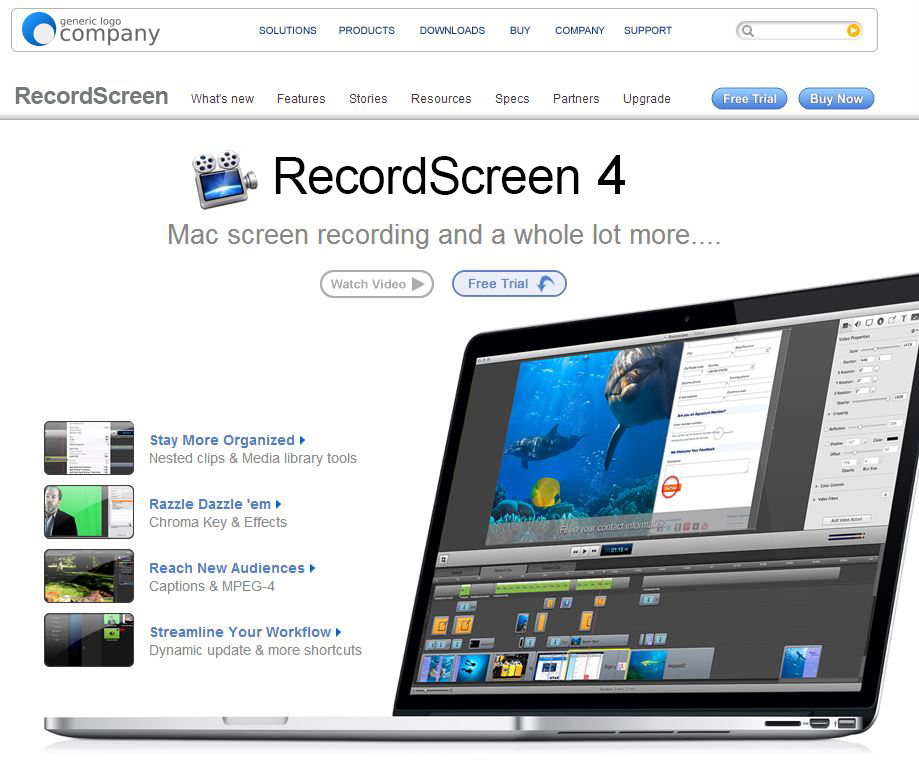
After clicking “Buy Now” it’s reasonable to assume that the user expects to have the primary product in cart already. In this case, the “Buy Now” button does not lead to a cart. Instead, this checkout process guides the visitor to an interstitial page that cross-sells another product.
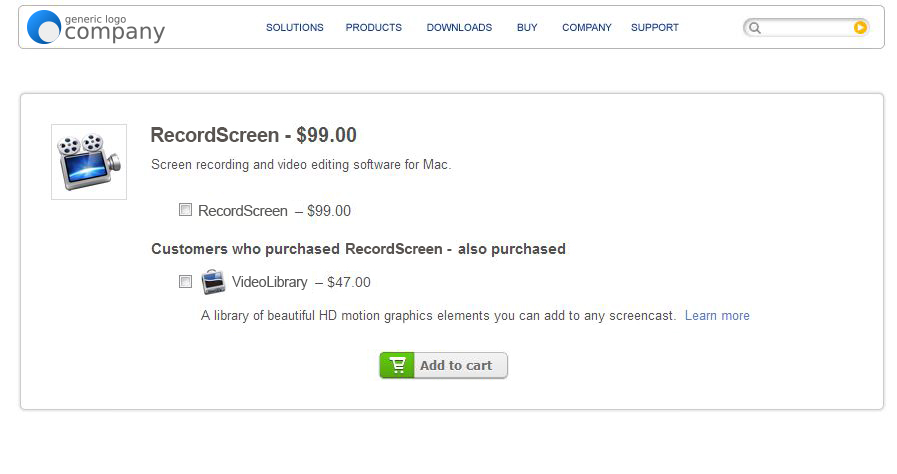
The problem with this page is that the user is asked to add the VideoLibrary product to the cart even though they already made this selection on the previous page. If the user misses this cue (which is likely given the fact that most website users simply scan content without looking too deeply) and hits “Add to cart” without checking a box, a pop-up error message appears asking the visitor to make a selection.
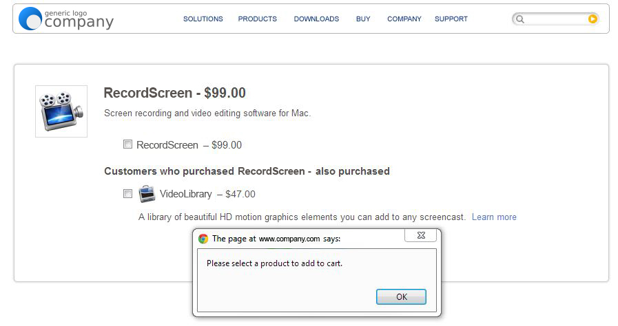
When the user presses OK on the pop-up something strange occurs: Instead of allowing the user to select the product, they are automatically routed to a broken cart without any products and no clear way to navigate back to the product selection page.
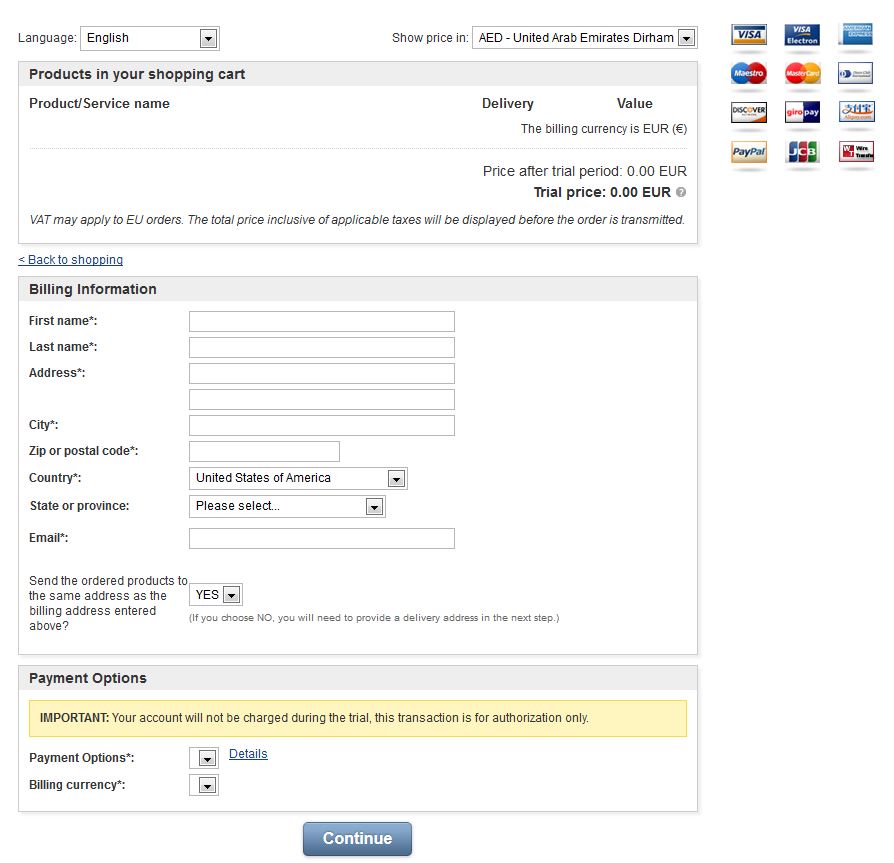
Not only does this interstitial extend the length of the checkout process by several clicks, it also sets up the visitor to experience a lot of confusion. This is a major fail from a usability standpoint.
As always testing is the key to figuring out whether interstitial pages work for your business. But breaking the cart is a surefire way to kill conversions.
Keystone
If a customer clicks “Buy Now,” bring them to the cart. If a customer clicks on a buy link and you display an interstitial page, use it to upsell or cross-sell – but make sure it works.
Pingback: Today's Top News For August 21