In the first part of this series, Conversion Killers in the Checkout Process, we discouraged online merchants from overcomplicating their checkout process with too many clicks and confusing paths to conversion. This week’s post, Conversion Rate Killers Part Deux, focuses on the display and functionality of payment methods in your cart by comparing two examples we encountered in the wild.
Alternative Payment Methods
Outsourcing your ecommerce payment processing is often a good decision because it strengthens your ability to accept online payments from customers across the globe.
And though credit cards are the most widely used online payment method they are not used by every consumer, so you have to make sure your ecommerce partner can offer your customers a powerful array of alternative payment methods.
This is especially true if you want to sell in certain regions like Germany, Netherlands and Japan where wire transfers, iDEAL and Konbini are the respective payment methods used extensively by consumers in those countries.
However, this partnership can sometimes be a double-edged sword for merchants. And just because you can offer many alternative payment methods, it doesn’t mean that you should display them every time someone comes to your cart.
Optimizing Alternative Payment Methods
Here is an example of the payment method section of an ecommerce shopping cart. Depending on where the customer is located, the shopping cart, using GeoIP technology, offers localized choices to shoppers.
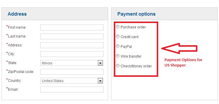
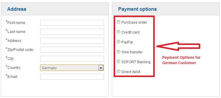
Typically, the decision of whether or not to offer a payment method for one type of shopper and not another is made after extensive market research and by using analytics to design a site that meets customer expectations and facilitate conversions (Access to this expert market understanding is another reason why online merchants should consider partnering with a global commerce service provider).
If the customer selects a payment method that requires more steps than the typical credit card transaction and requires the shopper to visit an external site to complete payment (as is the case with wire transfers), the next steps should be clearly explained.
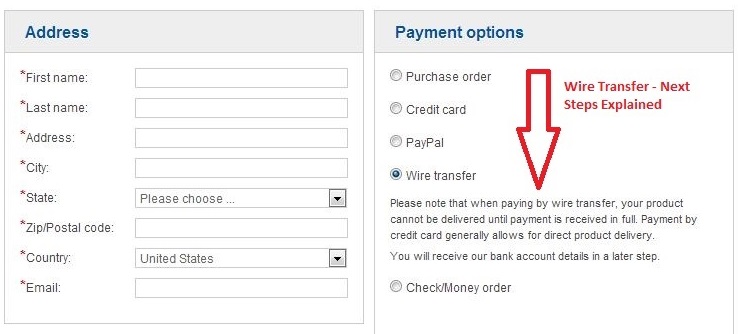
The example above present a seamless transition between merchant and payment processor. The payment options are localized for each shopper and the explanations of next steps are clear.
Furthermore, even though this shopping experience moves from webpages hosted by the merchant to webpages hosted by the payment processor, the branding is consistent throughout.
And by automatically populating or removing certain fields based on the shopper’s location and language settings, you reduce the amount of choices your shopper has to make.
Payment Method Confusion
In contrast to the seamless cart presented above, the following cart, which I came across during some online research and testing, features a variety of localized payment options (which in theory is the right thing to do), but completing the payment for some of them is difficult.
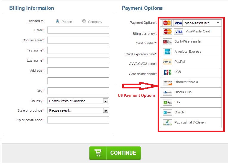
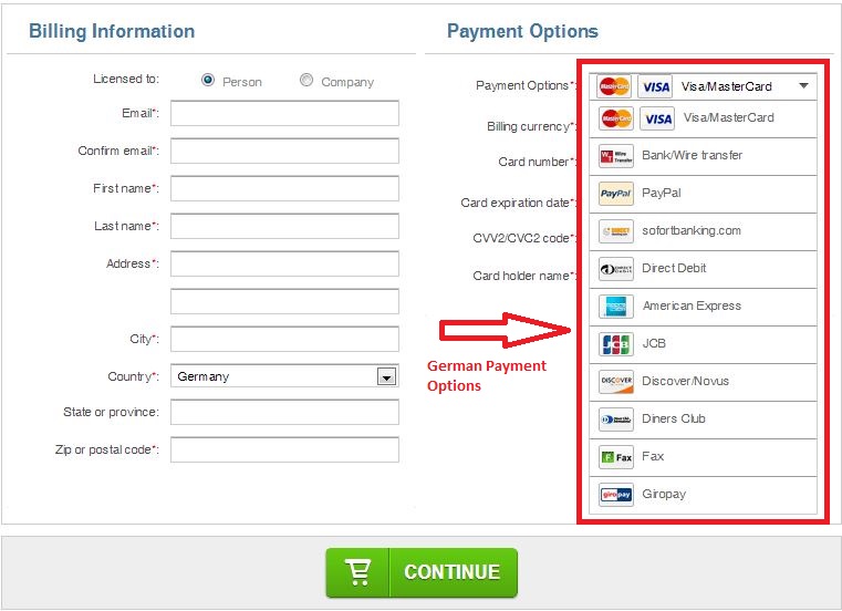
Let’s take the Diners Club payment option for example.
This is a rarely used payment method and, in my opinion, offers more clutter on the page than it adds value. There is no space to enter one’s card number and the explanations of the next steps that the shopper must take are non-existent.
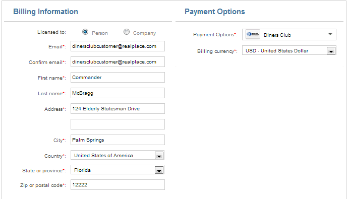
To actually complete this order, the customer must visit several redundant pages, none of which offer clear explanations about how to finalize the payment.
When I click the “Continue” button I am still not directed to a page where I can submit my payment information. Instead I am given a review page with another call to action to place my order using Diners Club.
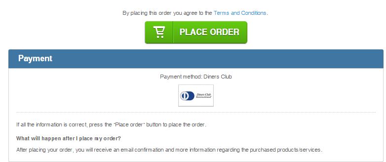
Once I click on the “Place Order” button, I am directed to yet another review page with what looks to be a red error message and information to submit money via a previously unmentioned payment gateway, but not with my Diners Club card:
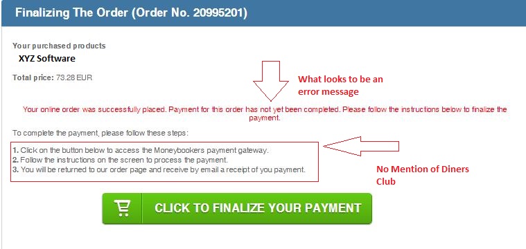
Alright, I’ve made it this far so I’m going to persevere and try finalizing this payment by clicking on the green button. Instead of being directed to another page, a new window pops up on my screen. This window offers me several payment options that I encountered on the first page of the checkout way back when.
However, I still cannot find any opportunity to pay with my Diners Club. Furthermore, the branding is totally inconsistent with my previous experience with other pages on this site.
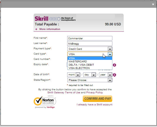
Without a consistent design between a website and the actual store, the authority of a business is often diminished in the minds of customers. – via Achieving Brand Consistency Through Effective Web Design.
Conversion Rate Killers
When a merchant partners with a payment processor, the goal is to make transactions easier for customers. But in order to achieve ease and simplicity, the shopper needs a simple and consistent experience.
Simplicity reduces the amount of choices your shopper needs to make which facilitates conversions. And consistency builds your reputation and allows your visitors to hear your messages and calls-to-action more clearly.
Keystone
To avoid conversion rate killers, make sure your payment processor offers relevant payment options and brand consistency.