We all know we should test our sites for conversion optimization. But where do we start? How do we find out what really works?
Building Keystones talked to Chris Goward, founder of WiderFunnel, a conversion optimization agency and author of “You Should Test That!” to get top notch conversion optimization advice.
From testing prioritization to mobile strategies, this two part interview provides helpful tips for increasing conversion rates.
Building Keystones: Which part of the buy cycle do you believe has the most impact on businesses when improved?
Chris Goward: It’s not uncommon to test websites with many thousands of pages. You can’t test everywhere at once and, with limited traffic, you could spend months in the wrong areas if you don’t prioritize properly.
The best places to start are where the biggest problems are. It’s different for each business. Some say you should always start testing in the checkout, at the bottom of the funnel. That advice is plainly wrong.
There’s also an over-emphasis on the “obvious” important areas like landing pages or the home page. But, those may not be the best areas for improvement. In fact, because they get so much attention, they may have the least potential for improvement!
The question is, “How should you prioritize your A/B tests?”
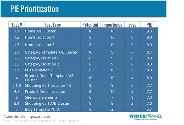
We always start a new client strategy with a prioritization exercise using the PIE Framework™ that we developed. You can do that too by ranking each test opportunity based on three factors: Potential for improvement, Importance to the business and Ease of test implementation.
Here’s an example of what a PIE prioritization could look like:
We’ve found that retailers are often thinking about only one of those three factors. Maybe they’re looking at their web analytics and seeing pages with high exit rates or bounce rates that are clearly under-performing. But, if you were to also think about their importance to the business — how much revenue and cost are they responsible for — they may fall down the PIE priority list.
BK: If I only have the resources to test one thing, what should it be?
CG: That’s a tough question to answer, yet the answer is as easy as PIE.
You see, it depends on which pages have the most potential for each business.
Most people spend too much energy optimizing their checkout and landing pages. Sometimes the pages in the middle of the funnel can have great impact too. Try testing the site-wide PDP template, or category page template, or internal SERP. Even the home page can be ripe for a redesign test.
To make the best decision, they should go through the PIE exercise I mentioned earlier to prioritize the greatest opportunity test area.
Often, by getting a quick win on a great opportunity page, you can then use that momentum to get resources for more testing.
BK: Do you think merchants should design checkout processes with minimal inputs per page, thereby lengthening the amount of pages in the checkout or should merchants include all submission forms on one page, thereby reducing the amount of page loads?
CG: That’s a great test to run!
Form interactions are some of the most interesting UX tests, and the best treatment depends on the business. The general principle is to focus the prospect’s attention on what they need to do with clarity and minimal distraction. There are ways to do that with more or fewer pages.
When we were planning tests for the 2010 Olympics store, one of the tests showed that a single page checkout worked better than multi-page. But, we’ve also seen some checkout forms work better with multiple steps.
There’s also a hybrid approach where the full form loads at once on a page but the sections are only revealed as the previous section is completed.
You should test that!
BK: With 200 million smartphones sold worldwide last quarter, how is it that 45 percent of businesses don’t have a mobile site or app? How important is it to execute on mobile? How urgent is it?
CG: It’s becoming more urgent due to four factors:
- The percentage of smartphone ownership is long past the critical mass and growing. Perhaps retailers could discount that in the past because few users were shopping on their phones, but…
- With increasing screen sizes, smartphones are becoming more functional for more complex interactions like shopping, and…
- The new 4G LTE phones are an entirely different experience than 3G. Many new phone owners are even reporting faster load speeds on their phones than their home Internet. Expectations from your website experience will rise along with their comfort in mobile shopping experience level.
- Google’s new “Enhanced” AdWords campaigns are now mandatory. That means advertisers can no longer exclude mobile from their campaigns. Read that again. If you advertise on AdWords, you now have a mobile site, whether it’s ready or not.
For those reasons and more, we now need to plan conversion optimization for a multi-device world.
Keystone
What are you waiting for? Get started on your conversion optimization efforts now, and do it the right way. It will be worth the hard work. Creating a test-and-improve culture will foster continuous advancements.
For more expert advice and insight from Chris Goward, visit the Wider Funnel blog.

Thank you for this article! Chris Goward is is one of my favorite conversion optimization guru!
Pingback: Prioritizing fixes for conversion « Interaction design