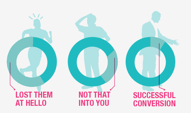
Are you converting visitors? Or are they going through the three step abandonment process described by analytics guru Avinash Kaushik as, “They came. They puked. They left.”
We learned in our interview with Tim Ash, author of Landing Page Optimization, that landing pages are the testing ground for conversion rate optimziation (CRO).
Landing pages are where customers decide whether they have any interest in becoming a user of your product, and they require important decisions about layout and calls-to-action (CTA). Because it’s hard to hit the bull’s eye on the first try, landing pages require planning, experimentation and testing to prove their efficiency.

This Pardot infographic, titled The Complete Guide to Successful Landing Pages, breaks down the successful B2B landing page into four complex elements:
- The design of the page – Important components of a well designed landing page include color and style consistency. Companies should also reduce options to navigate away from the page as much as possible.
- The design of the form the visitor fills out – Fields should be reduced to essentials, and redirects to other webpages should be avoided. Focus on capturing emails instead, because emails are better for relationship building than simple redirects.
- Provide value – Make sure the visitor feels rewarded for supplying personal information.
- Analyze & revise – In other words, know what you want to accomplish with your landing page. For B2C companies, your goal might be a quick cart conversion. For many B2B companies, the sales cycle is inherently longer and a landing page might be the first step in a long relationship.
We would love to hear you tell us about your own personal “Complete Guide to Successful Landing Pages.”
Use the comment section to tell us your success stories or any cautionary tales you have about landing page optimization.
The image below is the complete infographic from Pardot.
Embedded from the Pardot Blog