At a recent cleverbridge Networking Event, Fabian Rothe, Client Development Manager at cleverbridge, delivered five tips for increasing conversions in your shopping cart. Using multivariate testing, Rothe explained how to raise conversion rates for software products simply by reducing scrolling, reducing the amount of required customer details, presenting cross-sells effectively, enhancing the subscription checkbox and offering regional payment methods.
Conversion Tip #1 Reduce Scrolling
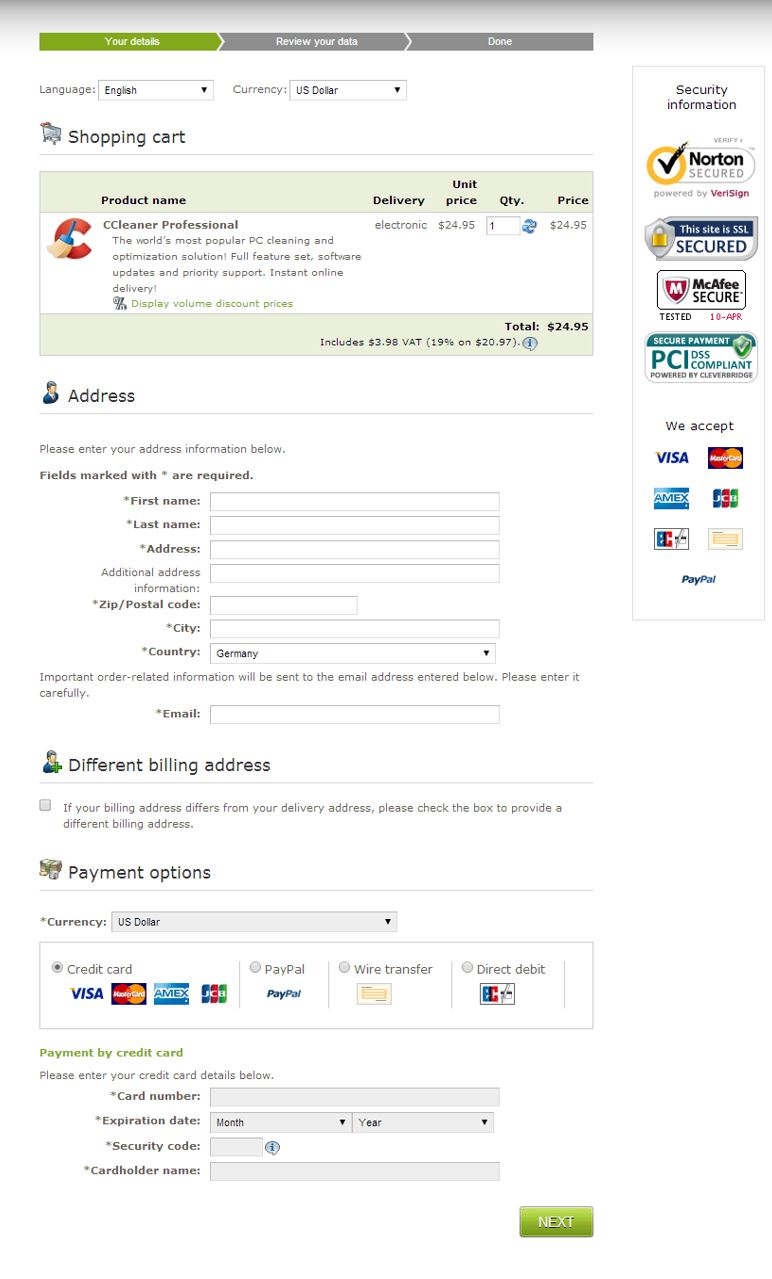
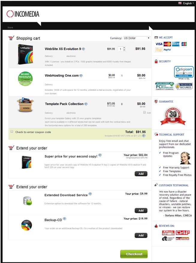
While scrolling can be useful for homepages and other marketing material, the shopping cart is not necessarily the best place for long pages. Typically, carts and checkout processes are built with order information like product and price placed toward the top left side of the page. Forms for personal information (often including first and last names, physical address and email address) are placed below the order information in the cart. Finally, the user, after some more scrolling arrives at the payment information section of the checkout process.
After testing a long scrolling checkout process page against one that reduced the amount the customer had to scroll down to complete the order process, Rothe saw that conversion rate for the shorter page were eight percent higher than the conversion rate for the longer page.
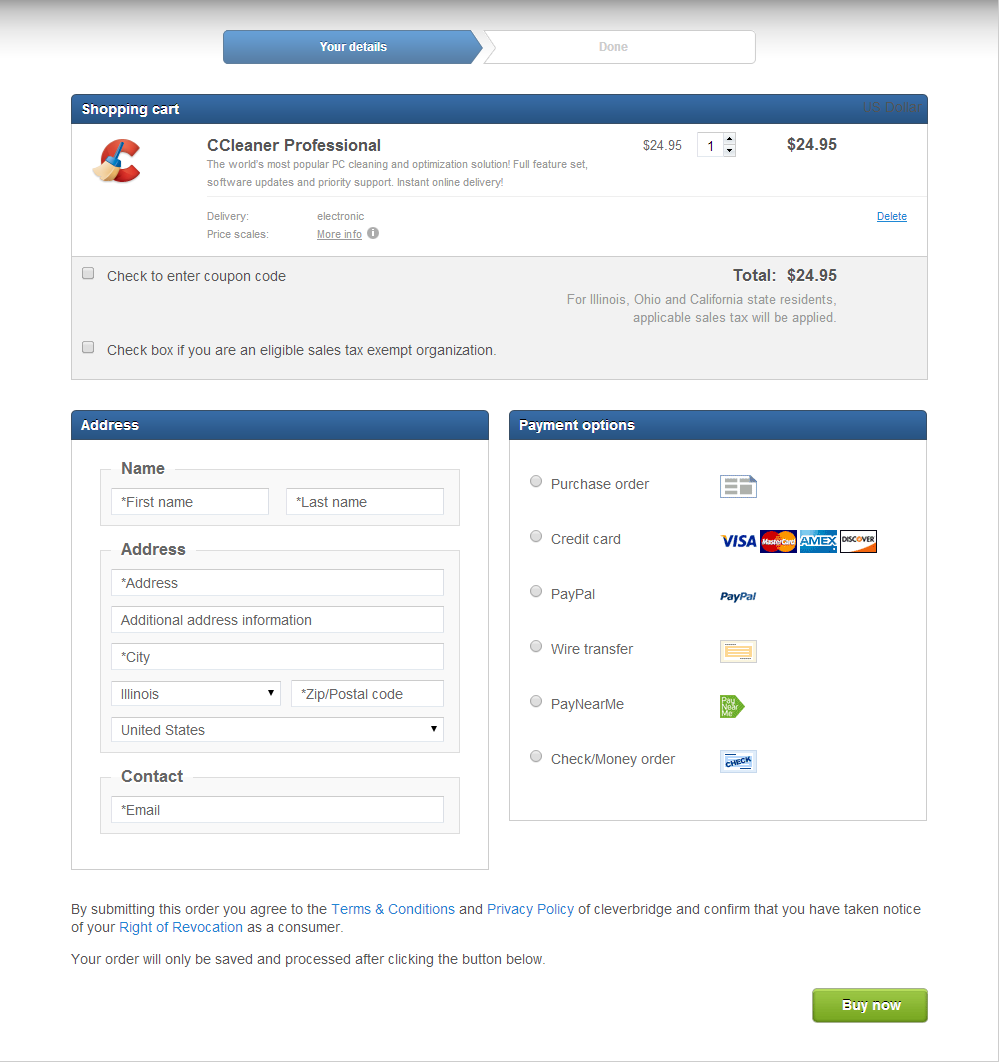
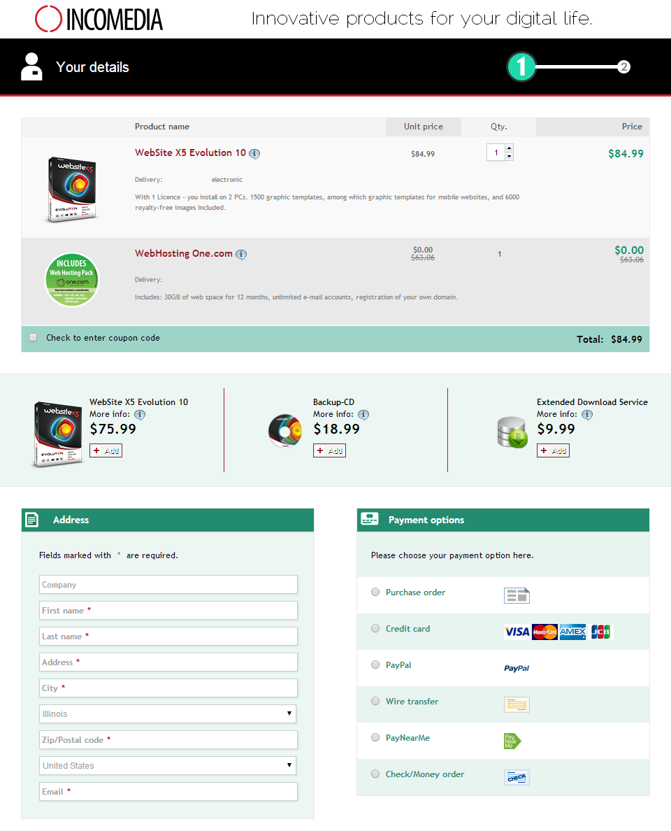
So what can you do to shorten the page and keep users from having to search for where to go next? Instead of placing the payment section below the personal information fields place them next to each other.
(Scroll down to see the two candidates.)
Conversion Tip #2 Reduce Required Customer Details
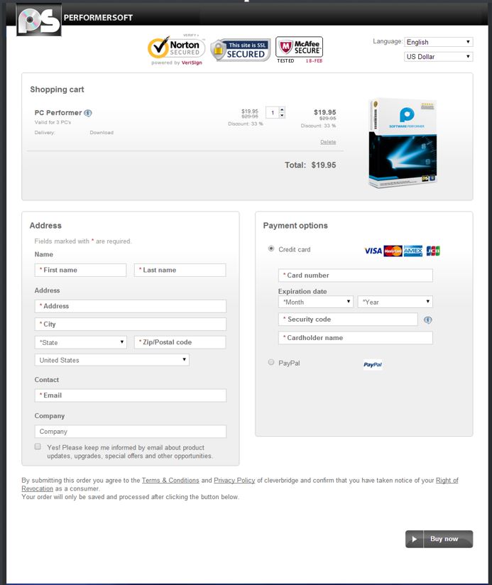
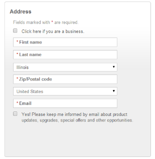
You need collect important data to optimize your offering and improve security. But what pieces of information are absolutely necessary and which are nice to have? If you’re not offering physical products, do you really need to ask for your customer’s apartment number?
In another conversion rate optimization test, Rothe removed the street address, city fields and company name from the required fields. This time, he saw the page with less field forms outperform its rival by receiving 10 percent more conversions.
(Scroll down to see the two candidates.)
“Think of every field in your checkout as a hurdle your prospect has to leap over. Then ask yourself if it’s worth the possibility of losing a sale, or thousands of sales, because you want to fill a database.” – via 7 Proven Secrets of High-Converting Checkouts | Copyblogger
Conversion Tip #3 Present Cross-Sells Effectively
Offering cross-sells to customers in the cart is an effective way to drive up average order value (AOV), but it can also lead to confusion and cart abandonment if done improperly. The first question you need to ask when it comes to cross-selling products in the shopping cart is how many should you offer? One product? Two? Maybe even five?! Rothe found that by testing the amount of cross-sells offered in the checkout process customer confusion was also reduced and led to higher select rates of cross-sells and more revenue.
The second question you need to ask when it comes to cross-sells is how should they be arranged? Real estate on a webpage is valuable, and as we showed in the first tip, you want to reduce scrolling in the checkout process as much as possible. And just as we showed above, you can improve conversion rates (in this case by seven percent) merely by changing a cross-sell’s vertical positioning low on the page to a horizontal position higher up on the page.
(Scroll down to see the two candidates.)
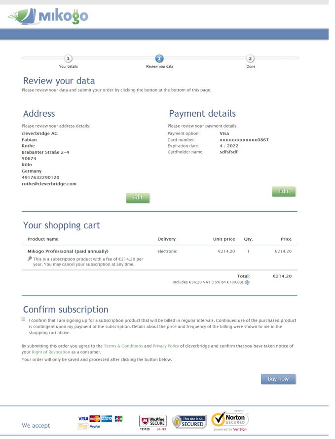
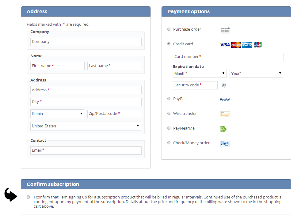
Conversion Tip #4 Enhance the Subscription Checkbox
The only thing better than getting customers to agree to a subscription is getting them to resubscribe at the end of the billing period. But not only is it difficult to get that initial sign-up, making sure that customers know they will be billed at future dates is important for reducing churn rate. In the following test, Rothe saw initial conversions for subscriptions from German customers increase 22 percent by inserting a large arrow pointing to the notice informing customers they were about to sign up for a subscription.
(Scroll down to see the two candidates.)
Conversion Tip #5 Offer Regional Payment Methods
Your customers come from all over the world, and they don’t all use credit cards or PayPal to shop online. Including regional payment methods in the checkout process goes a long way to improving conversion rates from regional customers – even if they don’t select that alternative payment method! Merely displaying a local payment method seems to increase consumer confidence in a brand.
In this last test, Rothe offered Japanese customers checkout processes that included a local payment method called Konbini, and one that did not. The checkout process with the Konbini option outperformed its rival by 16 percent – even though only 10 percent of all the customers actually chose Konbini to pay for their product.
Keystone
If you want to raise conversion rates consider optimizations in the checkout process that you can test and monitor.
