As companies are able to analyze customer data more easily due to the propagation of analytic tools like Google Analytics and Omniture Site Catalyst, optimization of all aspects of the customer experience are under close scrutiny to find places where customers may be dropping off.
Removing barriers from the customer’s order-completion process is the typical definition of optimization. However, the one of the most powerful barriers may be the easiest to remove. The location of your “Submit” button can be a major obstacle working against conversion.
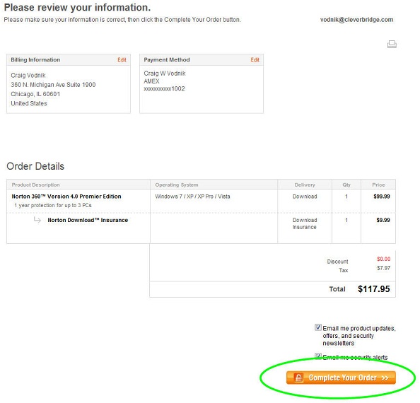
Typical confirmation pages place the “Complete Your Order” button near the bottom of the page so that customers can review all of their order details before completing the order. Symantec currently follows this industry standard and is displayed below:

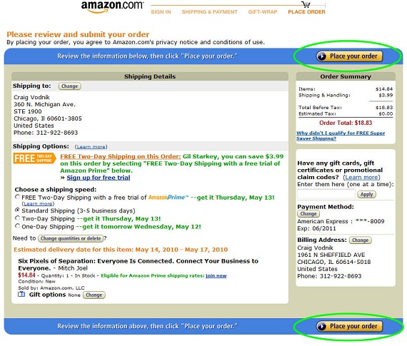
Want to increase customer conversion? Once the customer is in the final stages of the shopping cart, place a duplicate “Place Your Order” button near the top of the confirmation page. Customers who still want to review their order can scroll through the information contained on the page, but customers who simply want to complete their order can click the more easily accessible button. If your customers want to complete the order, get out of the way and let them! Below is a great example of how the Amazon cart easily allows customers to place their order at the top or bottom of the page.

Keystone
Why not give your customers the opportunity to place their order quickly? Take a good look at the placement of your “Submit” buttons and make sure they are hard to miss.
Excellent post Craig. I have noticed that an increasing number of online retailers are placing “Submit” buttons above and below the fold during the checkout process. Another good example of this is Zappos.com.
Thanks
Thanks, Eric. It sure seems like a trend and there will be some case studies that show a nice tick up in conversion rates because of it.