Last week, we explored how Democratic presidential candidates Hillary Clinton and Bernie Sanders facilitate online donations and email signups through paid search advertising campaigns, and we analyzed the layout of their checkout process.
This week, we look at how two of the Republican candidates, Jeb Bush and Rand Paul, try to persuade voters to become loyal (and paying) followers. This post will follow the same guidelines as our previous one, concentrating on paid search, landing pages and the checkout process.
The Ad
Unlike Bernie, Jeb and Rand have both implemented Google AdWords campaigns.

Unlike Hillary, they have not utilized ad extensions to help direct visitors to important subpages. The Bush campaign is using social extensions to let people know he has some 200-plus followers on Google+. which is strange, because he only has 40 followers on Google+, while Rand Paul has over 200,000 followers on Google+. Even stranger, nowhere on the Jeb Bush website can one find a link to his Google+ page. Social networks on the Jeb Bush site are strictly limited to Twitter, Facebook and Instagram. It seems like a poor decision to call out something in an ad that is ignored everywhere else on the site.

Another oddity present in both ads is that every word in the each description is capitalized. Capital letters should only appear in headlines and at the beginning of sentences.
I am also unimpressed by the fact that Jeb’s ad features a distinct lack of proper punctuation in the description (Be A Founding Member Of Jeb Bush Chip in $5 Today To Become One). Any proofreader worth their salt would have divided this message into two sentences and inserted a period after the word ‘Bush’ and before the word ‘Chip’. It’s not like the description is suffering from want of space: At 63 characters, there is room for seven more.
I do like Rand’s exclamatory punctuation and think it’s a good way to add some pizzazz to his messaging.
Overall though, I think Jeb’s messaging is much more focused and action-oriented, calling specifically for people to donate a reasonable amount of money to his campaign. This messaging makes the subsequent landing page more relevant.
On the other hand, the Rand Paul message, though very exciting with its appeal to emotion (Help Defeat The Washington Machine And Unleash The American Dream Now!), is unfocused and unrelated to its landing page, which asks for donations.
The Landing Page
Unlike their Democratic counterparts, who, in addition to soliciting donations also try to guide less involved visitors to email signup pages, these Republican landing pages are laser-focused on getting donations. There is another important difference between the Republican and the Democratic landing pages. The former are long, single page checkout processes, whereas the latter are concise multi-step ones with breadcrumb trails.
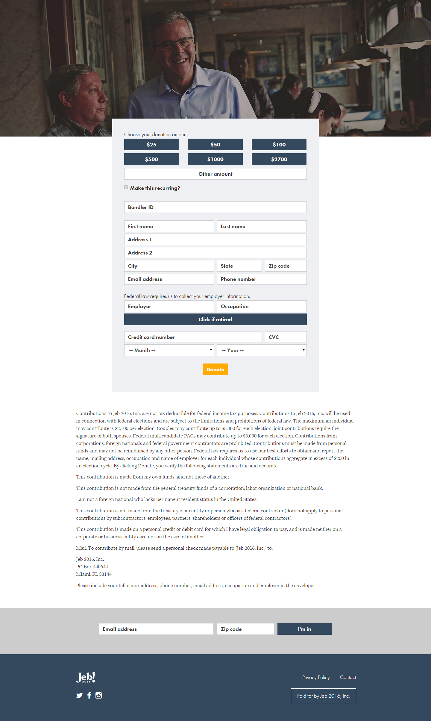
Here is what I like about the Jeb Bush landing page:
First, it provides an option for visitors to translate the page into Spanish. If you’re going to target a customer base like the Hispanic community, make sure your site is in their language. I also admire the campaign’s attempt to turn this one-time transaction into a recurring donation. However, the recurring donation never specifies the term of the payment. Is this going to recur every day, month or year? How much money is the customer actually signing up to donate?
Other things I don’t like:
- There is a navigation bar at the top of your landing page. This is basically asking people to abandon the cart. Meet Jeb? Sure, why not?
- There’s a very prominent ‘Donate’ CTA on the donation page. This is a distraction/useless item on the page and it literally has no function when pressed.
- The logo at the top right corner of the page is illegible.
- The ad asked me to donate $5, but the landing page doesn’t offer that amount. This implies a disconnect between the message of the ad and the experience of the landing page.
- One of the fields in the form is labeled Bundler ID. There is no explanation as to what this might be or whether it is necessary to have one in order to complete the order. It’s certainly the first time I have ever encountered this option while shopping online. The page is asking people to hunt around for information they may or may not have—another barrier to conversion.
- Credit cards are the only option for online payments. Even PayPal is not offered.
- The bottom of the page offers an option to signup for an email list, but when I complete the signup nothing happens. No page reload, no confirmation email, nothing. (Update: I just checked my SPAM folder, and guess what I found? That’s right: an email from the Bush campaign. Seems like someone’s email deliverability score isn’t too good.)
All in all, this landing page is filled with distractions, unclear instructions, unexpected options, and a lack of payment options.
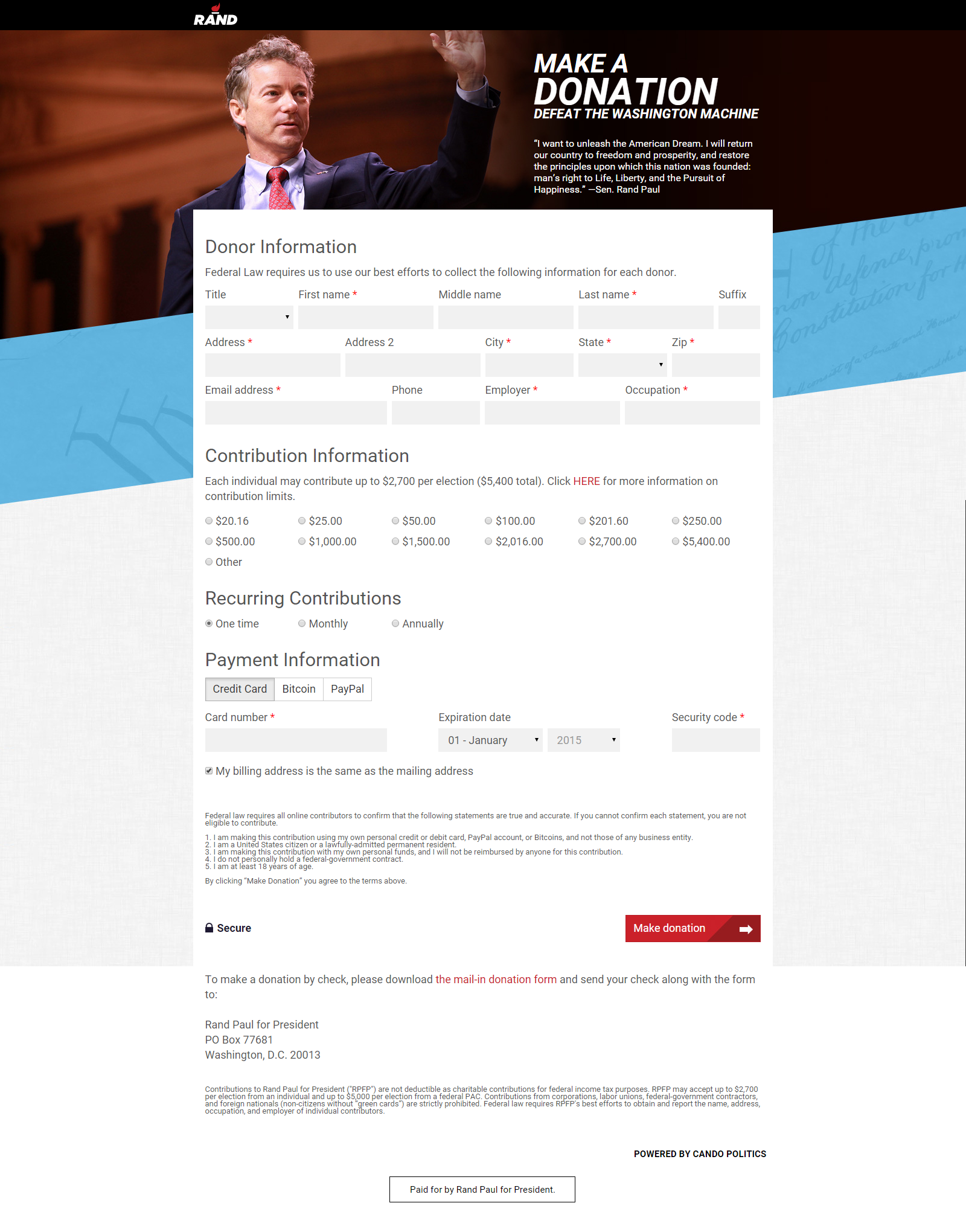
Here is what I like about the Rand Paul landing page:
- There is no navigation bar on the landing page. The only way out is to exit the page or complete the order. Like Hillary’s landing page this one has one purpose and one purpose only: Generate revenue.
- The option to donate in unique dollar amounts like $20.16, $201.60 and $2,016.00. These struck me as odd at first, but the more I think about it, the more it makes this cart stand out as something fresh and unique.
- Payment options! And lots of them. Offering not just PayPal, but also Bitcoin, in addition to credit cards solidifies Paul’s standing as a cutting edge candidate. This works as an appeal to his target base of anti-establishment non-conformists.
Here is what I don’t like:
- The nontraditional, horizontal layout of the field forms. Yes, Rand Paul is unconventional, but this layout makes me work harder to complete the checkout, and I consider it a barrier to purchase. I also don’t understand why I am asked to first fill out personal information and then select how much I want to donate. All in all, There are also too many fields to fill out, though I appreciate them letting me know which ones are required and which are not. This in contradistinction to the Bush campaign which made no attempt to let me know that a Bundler ID was not required.
- There’s a message on the page that says donations are limited to $2,700, but then, there is an option to submit $5,400.00. This smells fishy. One can be a maverick without being shady and breaking the rules.
Overall, the Rand Paul checkout process has some daring and fresh ideas for a presidential estore, but it also is overly-busy and not very streamlined.
Keystone
It’s great to design a landing page with a specific customer base in mind. It’s even better to make it streamlined and reduce barriers to purchase.
