The 2016 American presidential election is just around the corner, and the candidate pool is already full of a number of likely and unlikely potential heads of state. Since 2008, when President Obama leveraged the power of the Internet to promote his message (content marketing) and secure donations (revenue generation), those running for the highest office in the land know that a strong online presence is key to raising campaign funds and winning the White House. Similar to other industries like software, automobiles, insurance, etc., the political arena is filled with competing brands trying to win as many customers as possible—and there are many best practices that digital marketers and ecommerce managers can learn from their political counterparts, and vice versa.
As I did in 2012, I am going to analyze these online marketing campaigns and measure them against tried and true methods for converting online visitors. With about 20 people having already declared their intent to run, I am going to focus my analysis right now on just a few. This first part focuses on two leading Democrats and next week’s post will focus on two leading Republicans.
Based on criteria laid out in 5 Pitfalls To Avoid In Your PPC Landing Page, I am limiting my analysis to the realm of paid search to see what happens when I google a candidate’s first and last name, paying special attention to questions that focus on the user experience like:
- Is there a strong connection between the ad and the landing page (Good)?
- Does the page display well for mobile (Good)?
- Does it strive to generate recurring revenue (Good)?
- Is the home page used as the landing page (Bad)?
- Is the visitor distracted with too many choices (Bad)?
- Is the call-to-action (CTA) hidden (Bad)?
- Is the campaign asking the visitor to submit personal data(Good)?
Hillary Clinton (AdWords)

Right off the bat, I see a well-thought-out AdWords campaign. First, it points to a special landing page (www.hillaryclinton.com/Join), and not the homepage (https://www.hillaryclinton.com). Second, it follows AdWords best practices by including two site extensions (Volunteer and Donate Today), which improves Ad Rank and click-through-rate (CTR). So far, so good. It should also be noted that the campaign is interested in optimizing its performance by embracing new channels. The first screen grab I made of the campaign occurred on April 29, two weeks after Clinton announced her candidacy. At the time, no AdWords campaign for existed. The emergence of one is another good mark for the Clinton campaign.
Let’s explore the funnel further by clicking on the links in the ad. Onward!
Hillary Clinton (Landing Pages)
The Join page
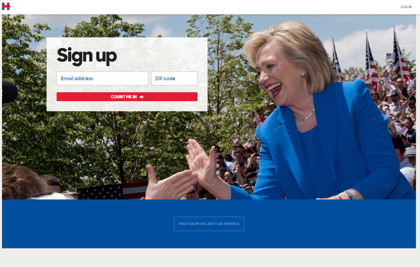
I wasn’t exactly sure about what I would encounter clicking on the Join page, but it turns out to be straight forward enough. They just want my email address and zip code. I am pleased by the simple nature of the page and am willing to supply my email address to find out more about this campaign. I also like the unique language of the CTA (Count me in). It tells me they are trying different things.
The Volunteer page
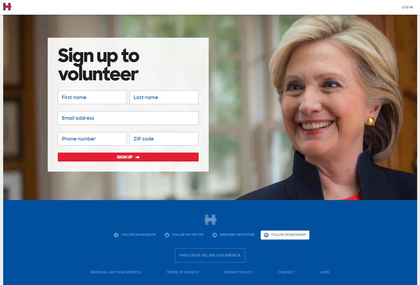
This page clearly involves a strategy of progressive profiling, asking for more detailed personal information to add to the email address and zip code data, like first and last name and phone number. This obviously involves a deeper level of commitment and is the appropriate place to ask for such personal information. After all, if I am willing to volunteer my time, I am probably willing to volunteer my name and number.
The Donate page
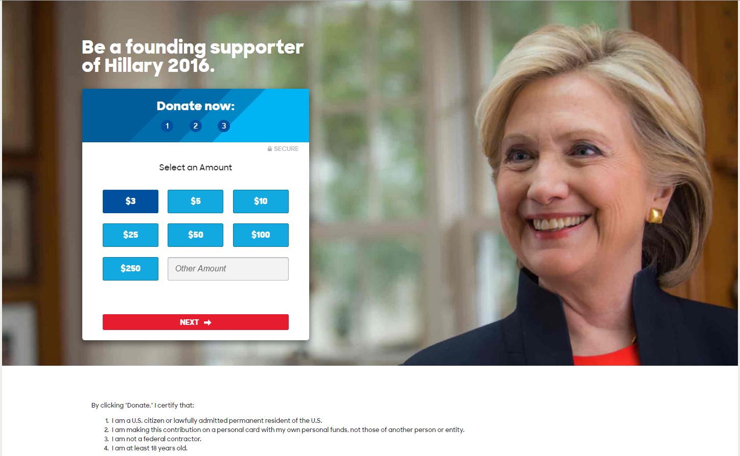
Then there is the Donate page. This is where the rubber meets the road. People clicking on this page know they will be asked to submit payments, and the page is excellently designed to accommodate this type of action.
Overall, I feel like there is a well-thought-out user experience with this ad campaign. Here is what I like:
- The checkout process is neatly designed with breadcrumbs that tell me how many steps I have to complete, and contains minimum barriers to conversion. For example, I don’t have to create an account and the personal information form in the checkout process only asks me to complete a bare minimum of fields.
- It has a check box to let users opt-in to recurring billings—always a smart idea.
- There’s an explanation as to why the checkbox asks for my occupation and employer. In other campaigns I have seen, this is not explained and was initially very confusing to me. Why should I give them that information? But here, it is clear that this information is necessary to comply with Federal law.
- The pages I visited minimize the amount of distractions, and where they are present, they seem to be purposeful. The Join page had just one single way to navigate away from the page, located unobtrusively at the top left corner of the page. The Volunteer page had many options to navigate away to the page to the campaigns social media pages, located conspicuously at the bottom of the page. Apparently, the intent is for already engaged fans to further engage with the campaign. The Donate page, however, is laser focused on converting that visitor into a paying one. No ifs ands or buts. There is absolutely no place to go but deeper into the checkout process. I think this is very smart.
Things I would change:
- The checkout process has an icon signifying that the checkout process is secure, but contains no explanation as to what method is employed to make the submission secure. The campaign could do a better job explaining how they secure their user data.
- The checkout process needs to offer more payment methods than just credit card and check. How about including PayPal to increase conversion rates?
Bernie Sanders (Organic result)
Unfortunately, Sanders has not yet implemented an AdWords campaign, and I am forced to click on his top organic result—the homepage to his campaign site. To me this is strike one.
Bernie Sanders (Homepage)
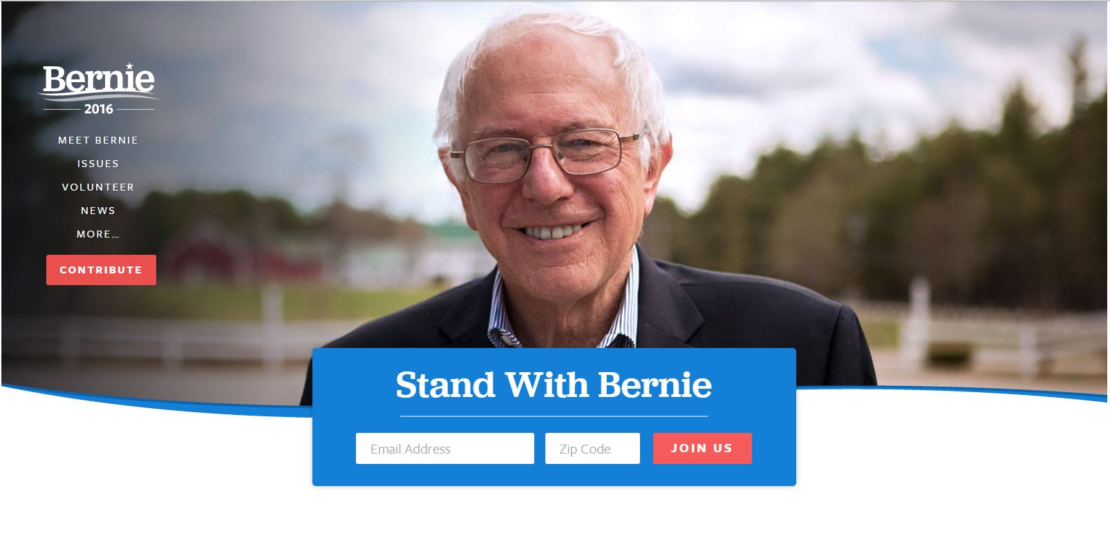
Here there are two competing CTAs vying for my attention—one for an email signup and one for payment.
The dominant CTA on the Bernie Sanders homepage seems to be the email signup one, so I click on that, and I am frustrated that the page reloads to checkout process.
Bernie Sanders (Checkout)
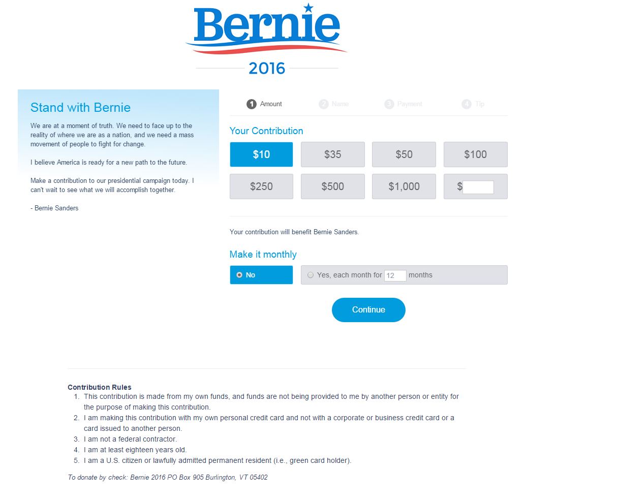
I am also confused by the fact that the page redirects to a third party payment processor (https://secure.actblue.com/contribute/page/lets-go-bernie). I find this odd, but at least I am in the checkout process.
Here is what I like about the Sanders checkout process (click through it yourself to see the details):
- There is no way to navigate away from the page.
- It offers breadcrumbs that allows me to keep track of my progress and how much more information I need to fill out.
- It offers an option for recurring revenue.
- It offers PayPal as a payment method. As far as I can tell, this is the only advantage over the Hillary campaign.
Here is what I would change:
- The checkout process is obviously hosted by a third party platform. To increase conversions, the brand should remain consistent throughout the checkout process.
- There are too many (read: unnecessary) fields in the personal information form. Reduce these.
- The city and state fields should auto-populate once the ZIP code is entered. Otherwise, the page is increasing barriers to purchase with all the typing and clicking I must now perform.
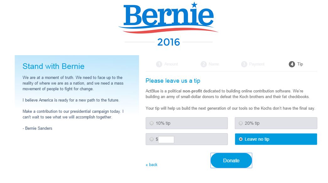
- There’s an option to tip the website just prior to submitting payment. I have no idea what this is, and it makes me reluctant to complete the checkout. Didn’t I just offer to donate money? Why am I being hit up again so soon afterwards?
Overall, I am lukewarm about the ability for the Sanders site to compete with the online Clinton campaign. It does not take advantage of the paid search channel, its user experience seems unfocused, and the checkout process has more barriers to conversion. Other than offering additional payment methods, I don’t see many strengths.
Keystone
To set your brand above your competitors, engage in paid search advertising, along with a well-designed landing page strategy, and optimized checkout process.

Great write-up, Elan.
One additional thing that I’d like to point out is how Hillary’s campaign plays on people’s emotions:
“Be a founding supporter of Hillary 2016”
This is a powerful implied value for the potential donor and likely converts additional people who might otherwise have second thoughts.
On the other hand, Bernie Sanders’ already has the “Stand with Bernie” tagline, but there is no “in the heat of the moment” additional emotional pull. It’s a missed opportunity.
Looking forward to the Republican site reviews and to see who makes your list of two. Any hints for us readers?
craig.
Great point Craig. When it comes to messaging, I agree that Hillary outshines Bernie.
You can even see this in the CTAs for their respective email sign-up. Hillary’s reads ‘Count me in’ and Bernie’s is ‘Join us’. I can’t recall ever seeing a CTA that says Count me in, and to me, that is also a more persuasive message.
As for the Republican candidates, I’ll give you a clue: Both have fathers who ran for president.