No one wants to see subscribers churning away. Ideally, a customer signs up and is in it for life, regularly renewing and purchasing upgrades and add-ons.
But no matter how heavily you invest in your marketing or product experience, your product or service isn’t a fit for everyone.
Instead of desperately trying to hang on to a customer like some overly obsessed spurned lover, once a customer decides they want to part ways from you, you should make that separation as painless as possible.
A short-sighted approach to solving the problem of customer churn (one which we see brands using all too often) might go something like this: “Too many customer’s are canceling? Let’s make it harder to cancel!”
What’s wrong with this tactic? First, based on legislation like CAN-SPAM and ROSCA companies must provide a clear and simple way to unsubscribe from emails or to cancel a relationship. Second, the frustration from unsatisfied customers will only multiply, leaving your brand vulnerable to growing dissatisfaction.
This blog post examines the unsubscribe process, and our goal is to analyze what makes a good customer experience for subscribers looking to leave.
Easy Unsubscribe Process
Adobe Creative Cloud’s marketing marketing messages are the textbook example of an easy unsubscribe process. They have a clear line in the footer text of their emails presenting an option to unsubscribe.
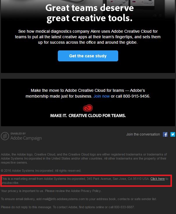
Just because a company makes their emails look correct does not necessarily mean that the process works as it’s supposed to. In the case of Adobe Creative Cloud, though, the process happens without a hitch. When a customer clicks on the “Click here to unsubscribe” link, they are taken directly to a simple confirmation page. There are no further steps to take, no additional buttons and no confusing phrasing that might be there to trick a customer into not unsubscribing.
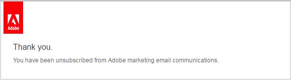
It is important to note, this process means that Adobe does not have a chance to ask a customer to reconsider their decision to unsubscribe. From the customer perspective, especially if one is frustrated by too many marketing emails, making the unsubscribe process as seamless as possible is preferable. Adobe must have calculated that the positive user and customer experience outweighs the missed opportunity to keep a subscriber in the marketing email fold.
Difficult Unsubscribe Process
We’ve removed the branding from this unsubscribe process from a service provider who shall remain nameless, but our reaction to unsubscribing from this marketing email was something along the lines of “OMG, this is the worst unsub ever.” Now while that is an exaggeration, this unsubscribe process is a classic example of a brand thinking that their customer data is more important than their customer experience.
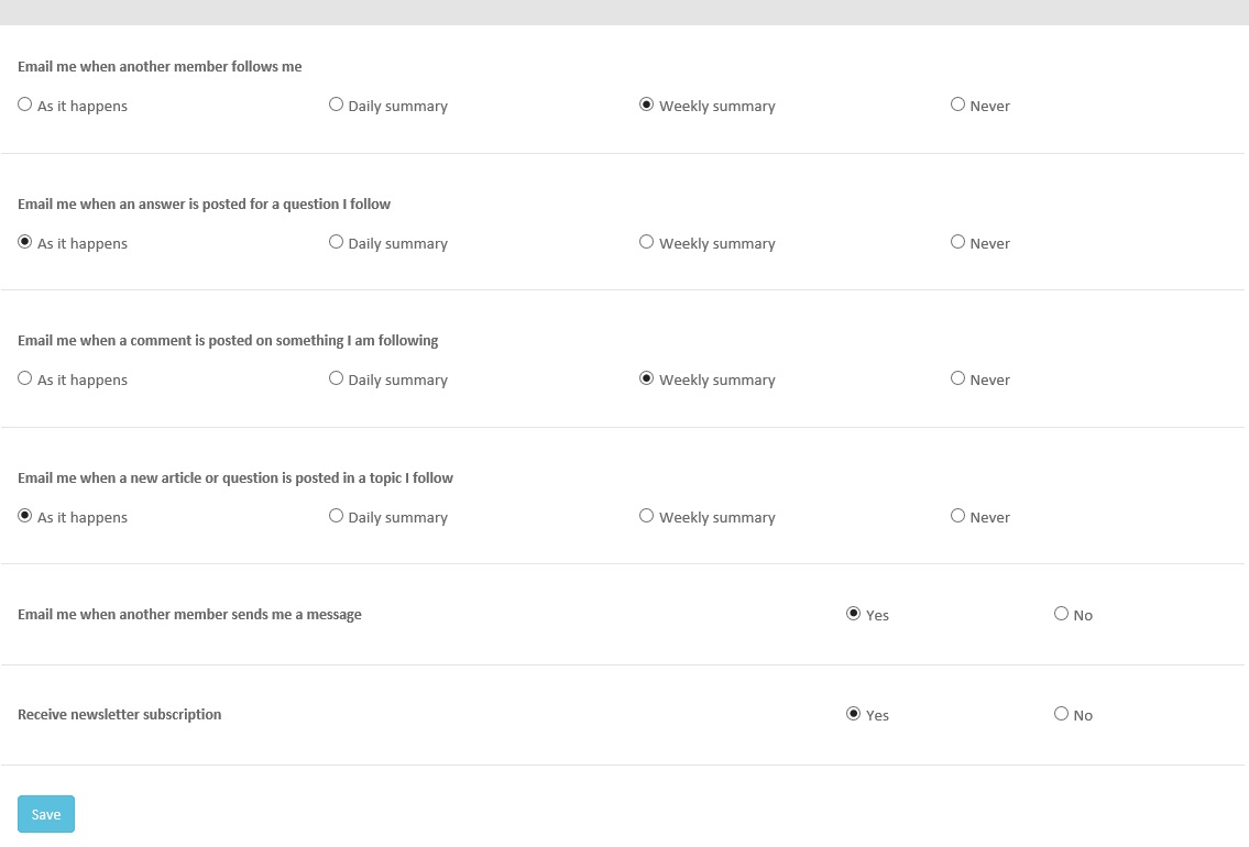
Clicking on the unsubscribe link in this company’s marketing email brings a customer to the above landing page. The pre-selected options after clicking the unsubscribe link allows the user to to continue receiving emails without interruption. When a customer truly intends to unsubscribe, landing on this page is confusing or frustrating. It requires the user to navigate a complex set of instructions in order to achieve their intended outcome.
The more barriers your put in front of a customer trying to complete their obvious objective, the less likely the customer will take your desired action. If you ask for too many irrelevant pieces of information, your conversion rates will drop. If you ask customers to put in extra effort in order to get away from you, you’re probably not incentivizing them to remain.
Optimizing the Unsubscribe Process
Here’s what you need to do. Take a look at your unsubscribe process. Is there a clear call to action for your subscribers to cancel? If not, then you’re probably not compliant with various laws in different countries.
Next, when a customer clicks the unsubscribe button, are they immediately unsubscribed or do they have to take further action and provide you more information before you agree not to send them any more email? If they have to take action to confirm that they want to unsubscribe, is the pre-selected option to continue receiving email or is there a simple click to confirm that they meant to cancel?
If you have decided that you need a customer to jump through hoops to cancel their subscription, take a look at your data. Is it providing you meaningful insight, and are you taking meaningful action based on that insight? If not, then it’s likely that you’re providing a frustrating user experience without any benefit to your overall business.
Keystone
User experience, and overall customer experience, is important at every touchpoint — including when customers are leaving the fold. Different companies take different approaches. Whether a company uses multiple steps in a positive way or a frustrating way defines the kind of user experience their customers will have.
